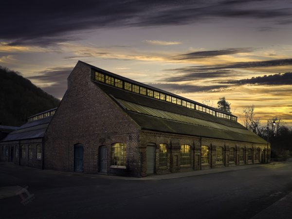
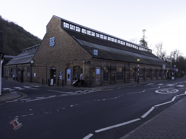
I make no excuses when I state that this is a heavily-edited image of the Merrythought teddy-bear factory in Dale End, Ironbridge – now more commonly known as the Co-Op.
Taking a memorable photograph of this building now is virtually impossible due to the multitude of signs and road markings that adorn the exterior. I started my post-processing by removing some of the signage and people, but as I progressed, it seemed that the final image was going to work far better if it became more of a re-creation of the building in its heyday.
This took some more careful editing, including replacing some of the doors that were originally there. Finally, I replaced the boring, plain Winter sky with a golden sunset and made a day-to-night conversion, which included lighting the interior of the building.
Some may say that this is taking editing too far – but I think that it makes a nice image of an industrial building that is otherwise uninspiring. What do you think?
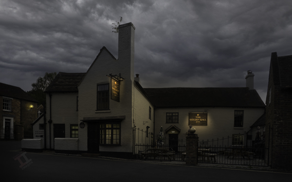
Situated right opposite my best friends house, I spent many teenage evenings in this hostelry. Banks’ mild was 70p a pint and a beef burger in a bun was 50p – so you could have a decent night out for less than a fiver! As you can guess, this was a fair few years ago.
I haven’t set foot inside for decades now, but the outside looks much the same as I remember it. I had been past a few times to get the shot but there had always been a delivery van or car parked in front, however on this occasion I was pleasantly surprised to find it it was clear and quiet.
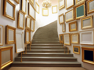
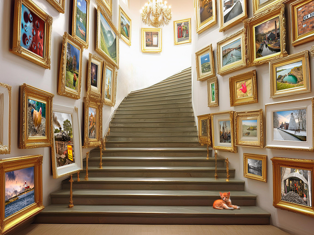
I was asked recently how I created my advertising scenes. The ‘scenes’, such as the stairway in Playing to the gallery, were created in an online Artificial Intelligence (AI) generator app called Gencraft, and then each photo frame was filled using Photoshop and its Transform tool.
However, I have now installed the Beta version of Photoshop v26, which uses Firefly Image 3 Model to create generative images using the ‘Generate Image’ function. This function isn’t new, but it has been updated, and so I thought that I would give it a try to see how it compared to using Gencraft.
I typed in the prompt “Stairway with empty picture frames“, and then in ‘Effects’ I chose the ‘Beautiful’ style.
It gave me three options, and I chose this one, mainly because of the multiple frames it had generated for me to populate.
However, all of the choices were pretty good, and certainly comparable with Gencraft.
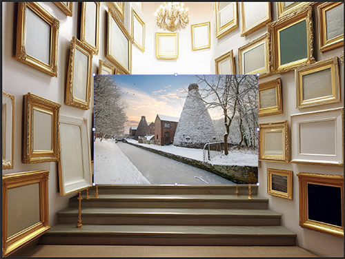
Now came the painstakingly laborious task of filling each empty frame with a canvas. First I had to open a chosen image, chose ‘select all’ and then ‘copy’. I then went back to the stairway image and pressed ‘paste’. This placed the photo image onto the stairway image, on a separate layer, in the centre.
I then used the ‘Distort’ option in the ‘Transform’ tool to grab each corner of the image and drag it into the corresponding corner of the chosen picture frame. It pays to be quite accurate at this stage to make sure that the perspective remains correct.
So far, so good, but I now had to repeat the exercise 27 times!
It was important to reduce the opacity of those towards the rear of the image so that the colours didn’t appear too saturated, and therefore to give depth to the scene.
In summary, the artificial intelligence in this beta version of Photoshop gave a very good foundation for the image, and I’ll be using it in future in preference over Gencraft, if only because it contains my post-processing to a minimum of different programmes (I always think that transferring from one post-processing programme to another must create some degradation to the file).
Some of these images are, as-yet, unpublished on Photo4me. See if you can find which ones they are.
Here in the UK, property and land is sold through professionals called ‘Estate Agents’, which dates back to when large swathes of land (an estate) were owned by individual families (the landed gentry), usually living in a grand hall in the centre. They employed an agent to manage the rent from the paupers who lived on the land, and the buying and selling of land to improve the estate portfolio.
Over in America, these professionals are called ‘Real Estate’ Agents (or Brokers). The term ‘real’ derives from Latin, meaning actual or genuine, and it simply refers to the actual, physical land and property that belongs to an estate.
If you want to rent out or sell your property (or estate), then you need to market it to get the best reward, and this usually requires the use of high-quality photographs to present the property in the best possible way. This involves ‘property photographers’ or, in the USA, the slightly more glamorous-sounding ‘real estate photographers’ (of course, to save costs, estate agents often just take the photographs themselves using a camera phone, but, like everything, you get what you pay for).
There are several reasons that you may wish to use a professional photographer rather than taking your own (or allowing the estate agent to):
The camera:
Actually, it’s not the camera that matters most; it’s the lens. The standard lens on most cameras and phones is in the focal range of 35-55mm because this most accurately represents the field of vision of the human eye. Unfortunately, this is often not wide enough to encompass an entire room and can also make a room look long and narrow. You really need a wide-angle lens, closer to a focal length of 10mm, to capture everything in one shot. People need to see this to get a good representation of a room.
A wide angle lens also has an effect that estate agents love; it makes a room look much larger than it actually is!
The software:
The drawback of using a wide-angle lens when you are close to a subject (as you are in a room) is that the sides of the image adopt strange angles due to the nature of the lens. Tall pieces of furniture, or doorways, can then appear as if they are leaning backwards. It’s a term known in photography as ‘barrel distortion’. Good post-processing software can straighten out the sides of the image to give a far more natural look.
Before
After
Taking the image as a RAW (unprocessed) file, and then processing it in post-processing software can also bring out details in the shadows and preserve detail in the highlights (see ‘The light‘, below).
The ‘eye’:
Professional photographers have something called “the photographer’s eye“. What that means is the ability to be able to scan the image, usually before actually pressing the shutter, to see things that are out-of-place or that capture the attention unnecessarily (I’m sure that you have seen humorous photographs on social media of people’s bedrooms with ‘personal items’ left unintentionally on the side!). Moving a coffee cup, magazine or family photograph, for example, can have a huge impact on making a room look more attractive. It is important to take as much personality out of a room as possible (without making it too sterile) because the seller’s style may not match the purchaser’s desire.
The light:
When you photograph outdoors, you get directional light from the sun, which creates shadows. However, these shadows are then ‘diluted’ by the brightness of the rest of the sky, which acts like a giant diffuser. When you take a photograph indoors using ambient light, the light from the windows gives directional light, but there is no light from any other source. This can create deep, hard, shadows and, at the same time, the windows look completely white, as all of the highlights get blown out. Some photographers choose to use flash lighting instead, but this is quite harsh, and the windows then become very dark, almost as if it were taken at night.
There is a method called ‘flambient light‘, which entails taking shots of a scene with flash and shots taken of the same scene in ambient light and then merging them together in post-processing. Care has to be taken; otherwise, the scenes can look false. There is also the added problem of matching the different colour temperatures of the two types of light.
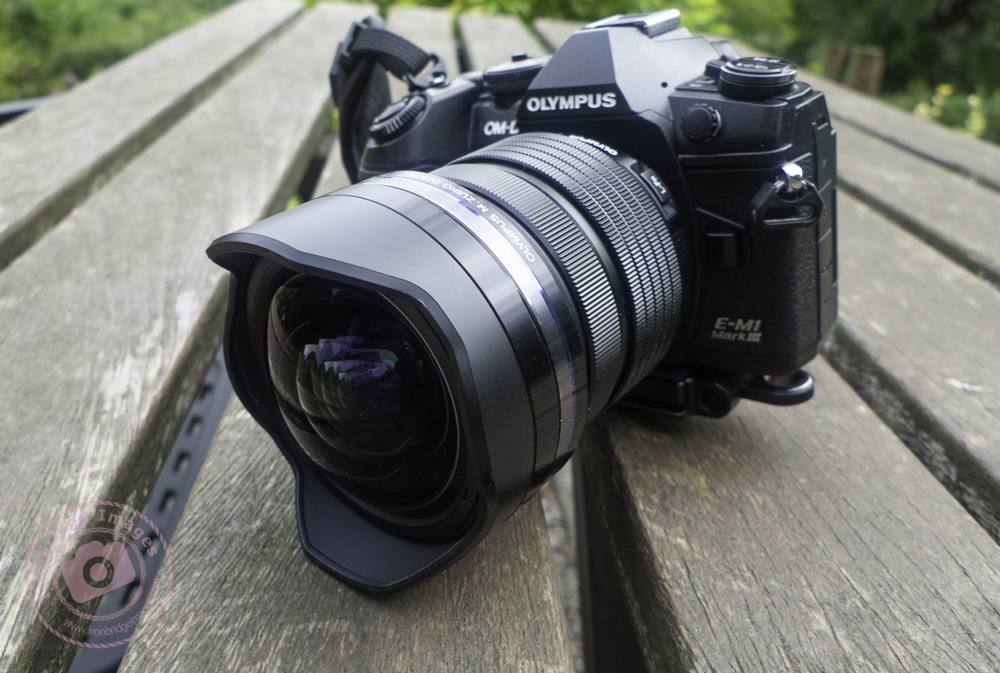
Another method (and the one I prefer) is to use High Dynamic Range (HDR), which involves taking multiple (3 or more) shots of the scene in ambient light at different exposure levels and then merging them together, retaining detail from the shadows and highlights. Some cameras (such as my Olympus OM-D E-M1 Mark III) can do this automatically in-camera. To minimise noise in the shot, a low ISO is required, but this then creates longer exposure times. There is also the need to keep the camera in exactly the same position – so mounting the camera on a tripod is necessary.
The temperature:
We are not talking about the room temperature here, but rather about the temperature of the light (also know, in photography terms, as white balance). This can have a huge impact on the perceived ambience of a room; a bedroom needs to look warm and inviting, whilst a bathroom needs to look cool, clinical and clean.
Slightly cool and uninviting (white balance 5200K)
Warmer and cosier (white balance 5800K)
The aspect:
The ‘aspect’ of the photograph concerns the height and angle that the photograph is taken. It is important not to take the photograph from too low down, or too high. This may change dependant on the size of the room, and the type of room. The direction that you point the lens can also have a big effect, as can the position that you take the photograph from.
In most cases you will want to take the main shot from the doorway, so that you see the room as you would when you entered it. However, for some feature shots, you may want to take the photograph ‘head-on’.
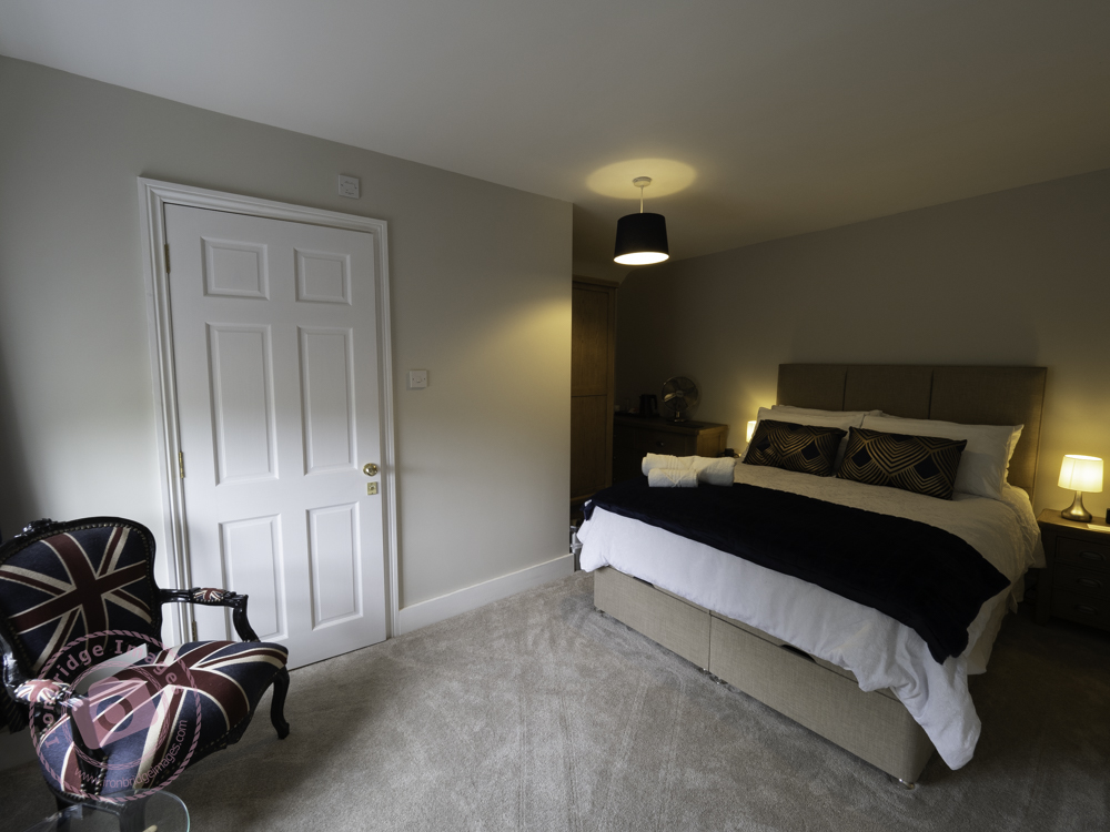
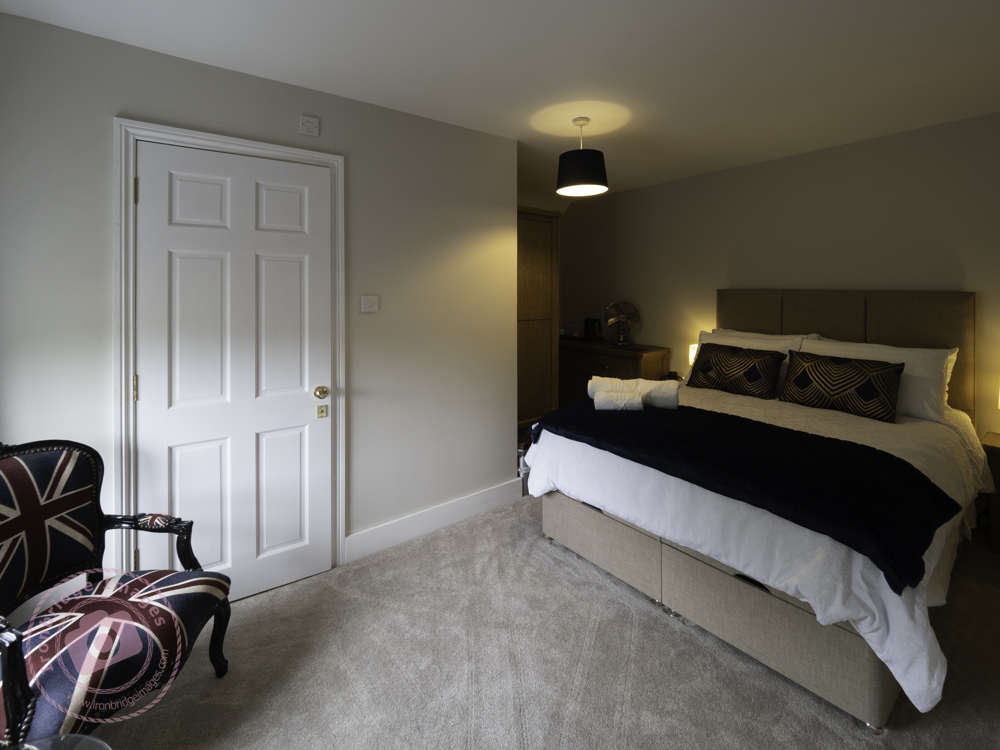
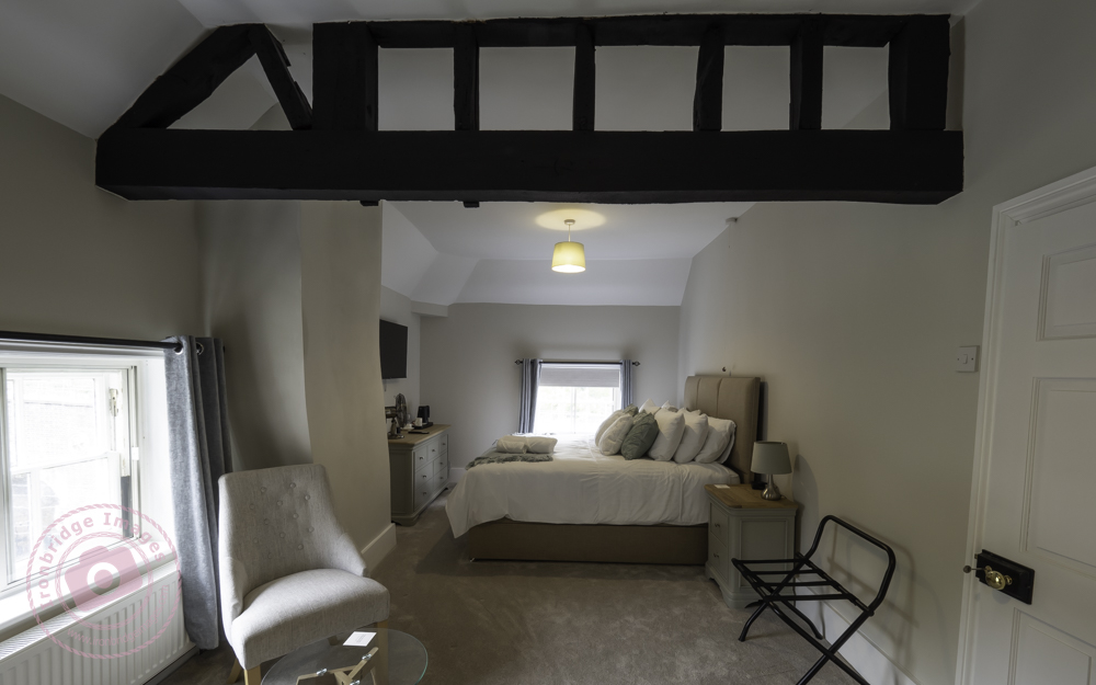
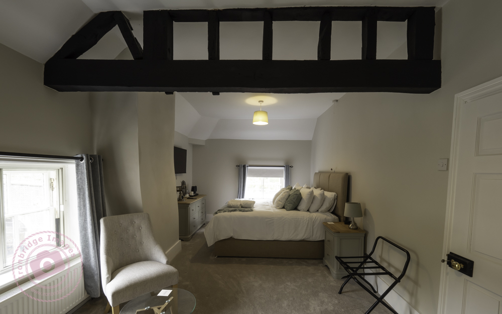
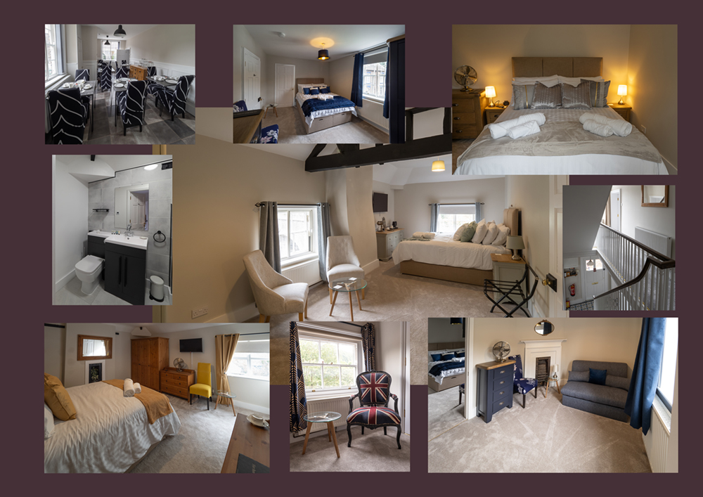
After that rather long preamble, we now come to the subject of this blog post:- that I have been taking some photographs of the interior of a property that will shortly be used for bed-and-breakfast accommodation. After a brief tour I was pretty-much left to my own devices (always the best option) and, over 2 hours, took 80+ images. These were then whittled down during post-processing to 40, and were supplied as both full-size images (preferred by publishers and printers) and also as smaller, lower-resolution versions (for website and social media use).
Hi John, Thank you so much for these, they look great. Really appreciate it
viaduct guesthouse
The Viaduct Guesthouse, Coalbrookdale, in the Ironbridge Gorge, will be opening in Autumn 2024. Best of luck to Kay & Paul on their new venture.
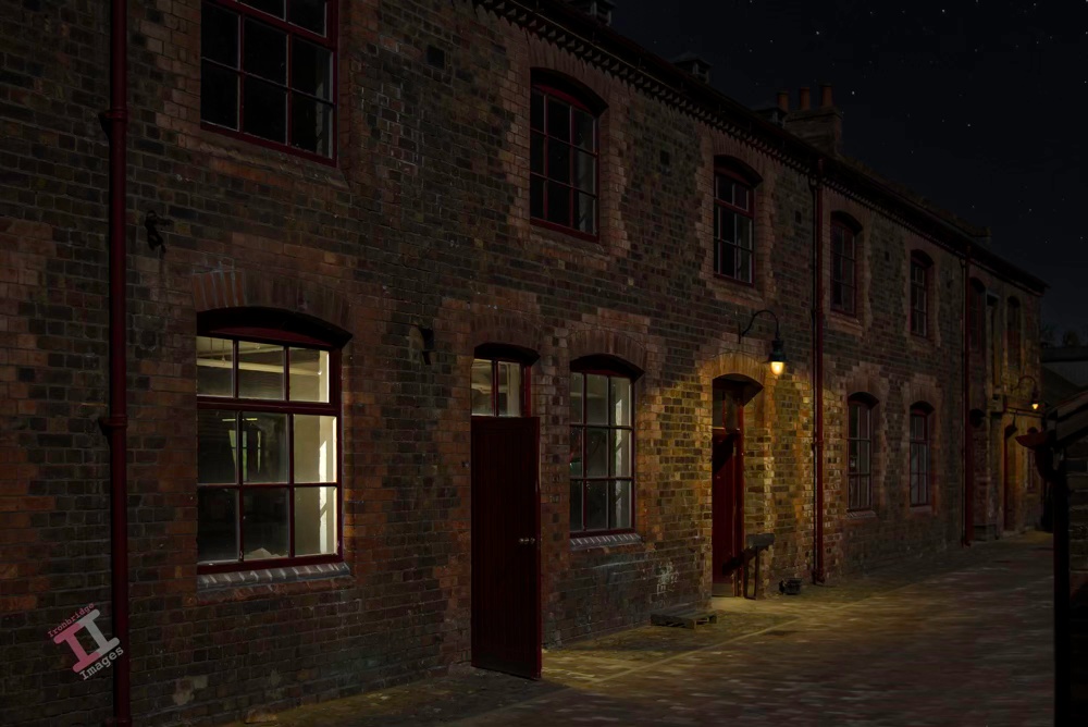
At first glance, this may appear to be a row of terraced houses, but it is actually a set of Victorian offices inside the Craven Dunnill encaustic tile works in Jackfield, Shropshire.
This was originally taken on a sunny day in May 2009 (remember when we had sunny days in May?), but it was more of a record shot and not particularly inspiring. Therefore, I decided to convert it into a night-time shot using post-processing.
The original shot before the conversion
Firstly, I adjusted the converging verticals. These are usually noticeable in architectural shots because the camera lens is a lot lower than the top of the building, and it gives the appearance that the building is leaning back and/or inwards. Photographers who take a lot of architecture often invest in a ’tilt shift’ lens, which adjusts the perspective in-camera, but post-processing software such as Adobe Lightroom can do it quite easily.
I then needed to remove the very hard shadow created by the building in the bottom-right of the image because this shadow would be out of place in the final image. Whilst I was doing that, I also removed the annoying safety signs on the doors and the dangling electrical cables.
Finally, before carrying out the day-to-night conversion, I replaced the bright blue sky with a more suitable night-time one.
I reduced the exposure of the entire image to give a night-time effect whilst leaving enough light to retain some of the features. I added light to the two lanterns and gave them a slight yellow tint to suggest tungsten light. I also added light to the inside of the nearest room but gave that a slightly bluer tint to differentiate the type of lighting indoors.
Finally, I added incidental light from the open door and windows. This is the most important part of a day-to-night conversion; getting the angles of the light spill and the shadows correct for it to look realistic.
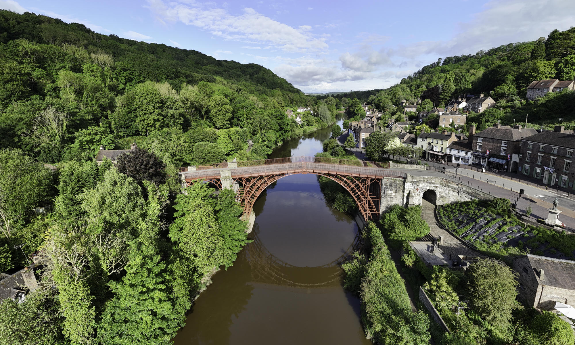
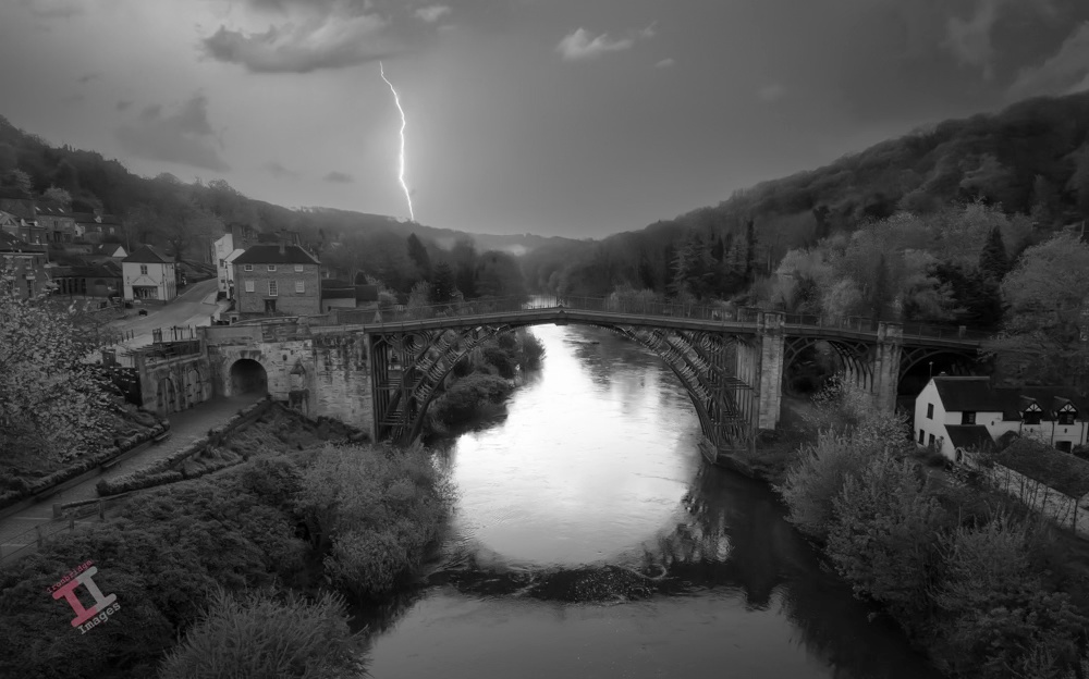
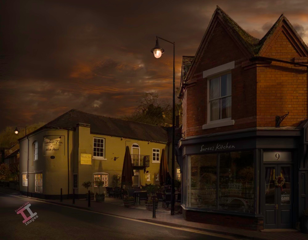
This image encompasses two of my current projects: it is a day-to-night conversion (including a sky replacement) and a black-and-white conversion. It was taken with my drone, early one morning before the town had started to come to life and post-processed with Adobe Lightroom and Photoshop.
It was a shot that I had planned for weeks. Late in the evening I set up my tripod and tucked into a corner of the pavement to keep out of the way of any drunken revellers. The courtyard of the public house was thronging with an unexpectedly large crowd of people, constantly moving around, and the sky was overcast, covered with a thick layer of cloud. It looked as if my plans had come to nothing. Suddenly, everyone dispersed as if on command, and the clouds parted sufficiently to let the setting sun cast an orange glow over their edges. I fired the shutter and captured just one shot before the bar emptied its customers onto the pavement and rain clouds arrived overhead. It was time to go home.
Sounds like a great photographers story, and similar to those that you can read in most photography magazines. But it didn’t happen!
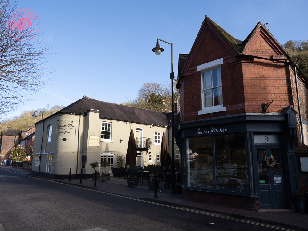
This is actually a classic day-to-night image conversion carried out in post-processing. The original image is here to the right, and was captured at 8am on Saturday morning (hence the distinct lack of people). I deliberately took the image for such a conversion and so wasn’t too worried about the contrast in the scene or the converging verticals.
These day-to-night conversions favour architectural shots, particularly when windows and exterior lights can be ‘lit’ to create character. I am fortunate to live in the Ironbridge Gorge, which contains many interesting buildings (and quirky street lamps) and so I can take the ‘stock’ images as I am walking our dogs in the morning (as I did here), without having to concern myself too much with the quality of light.
The conversion itself was carried out with a combination of Adobe Lightroom and Photoshop. It entailed a sky replacement and a plethora of light masks, and so took a fair amount of time – but I did enjoy the process of deciding what the incidental illumination from each light source should be, and how shadows would be cast.
I enjoyed it so much that I’m going to do some more! If you want to see them as they are posted, then subscribe to this blog (for free!) to keep up-to-date via your email inbox or the Reader app.
In 1898 the local newspaper carried a report of a nasty accident that occurred to a young girl on a bicycle in Jackfield:
On Saturday Miss Milly Pritchard of Ellsmere met with a serious accident. It appears that Miss Pritchard (who was on a visit at Mrs Doughty’s, Tuckies House) went for a bicycle ride with Miss Doughty, proceeding from the Tuckies House down the road leading from the Dingle to the Severn. From some cause or another Miss Pritchard lost control of the machine, which travelled at great speed, passing under the railway arch, and then swerved around and with great force came in contact with Mr Charles Perks’s garden wall. The unfortunate rider sustained a compound fracture of the jaw, also a compound fracture of the left knee, and the machine was smashed. Mr and Mrs Perks carried Miss Pritchard into their house and placed her upon the sofa, after which Miss Thompson (district nurse) and Mr George Bunnager (member of St. John Ambulance Association) rendered first aid. Dr. Collins of Broseley was sent for, and under his care Miss Pritchard is progressing as favourably as can be expected.
Wellington Journal, 30th April 1898
It doesn’t say how old the girl was, or what the after-effects of the accident were – although with compound fractures of both the jaw and the knee it can be assumed that it was a lengthy recovery. This was 50 years before the founding of the National Health Service in the UK which perhaps explains why the poor girl wasn’t taken to a hospital – because they were only available to the wealthy.
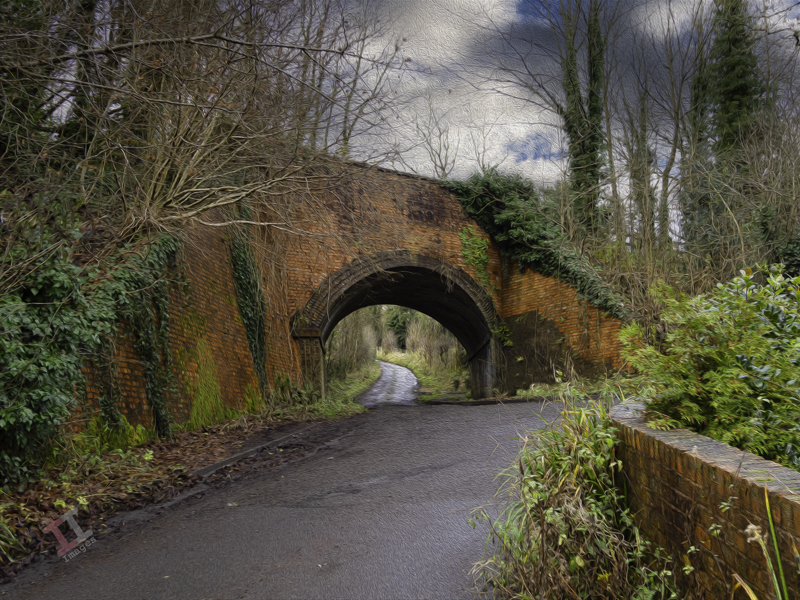
Here is the view that Milly must have seen as she careered down the lane, under the railway bridge carrying the Great Western Railway, and onwards into the wall beyond:
In reality the scene is littered with street furniture: height restriction signs, a salt bin, various random signposts and some plastic bollards leaning at odd angles. I removed them all in post-processing to recreate the picture as it would have looked at the time.
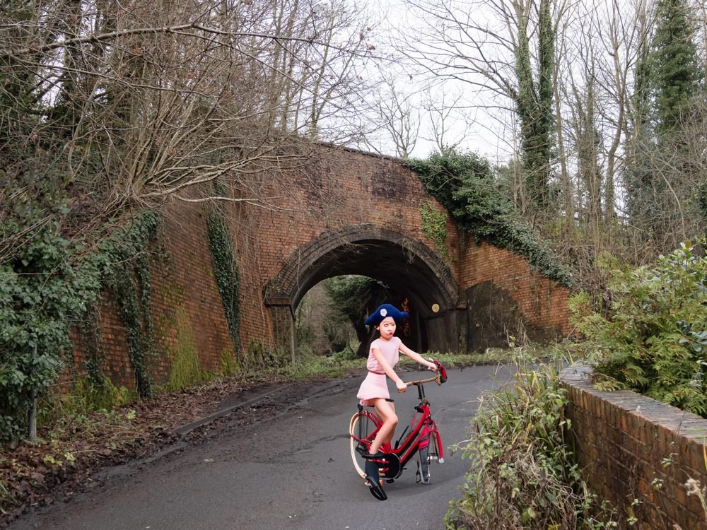
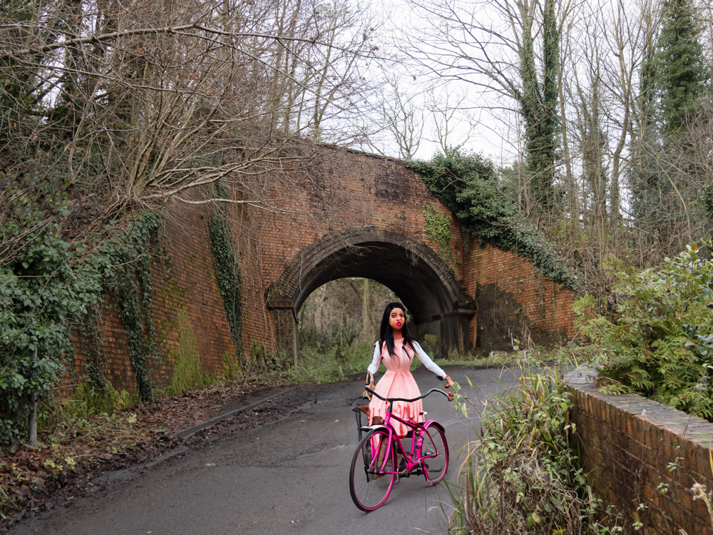
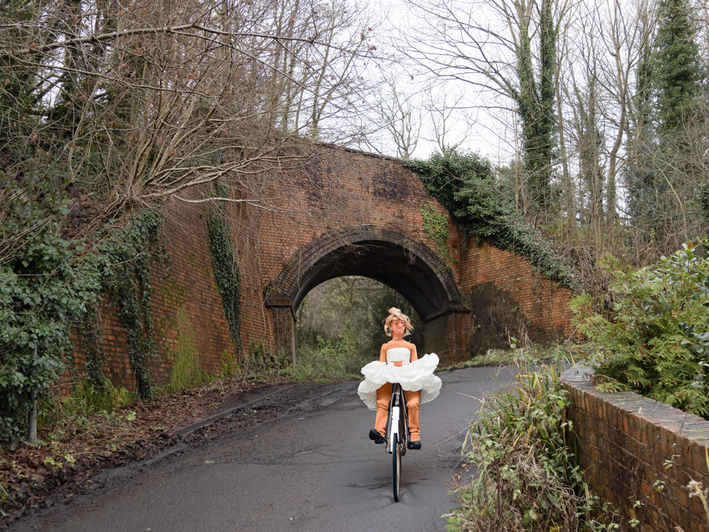
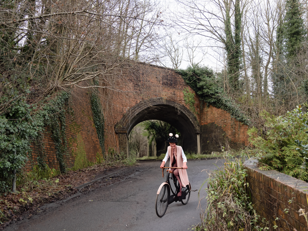
I had an idea to add “a Victorian girl on a bicycle” to one of the images using the ‘Generative Fill’ function of Photoshop, which uses Artificial Intelligence (AI) in order to create elements within an existing image. Here are the suggestions it gave me:
I don’t remember asking for her to be a pirate. And where’s the front wheel?
Nice lips. In fact, I’m pretty sure I’ve seen her in Telford Town Centre!
Miss Piggy in a tutu.
Return of the swamp monster.
Those of you who think that photography is dead because of artificial intelligence, clearly don’t need to worry just yet!
Milly may have survived the accident, but there was worst to come. Just 16 years later, the Great War (World War One) broke out which, as we know, was a brutal period in our history. Many died, including those from this small community, and a unique memorial was created in their honour. More of this in the next Secret Ironbridge blog post.
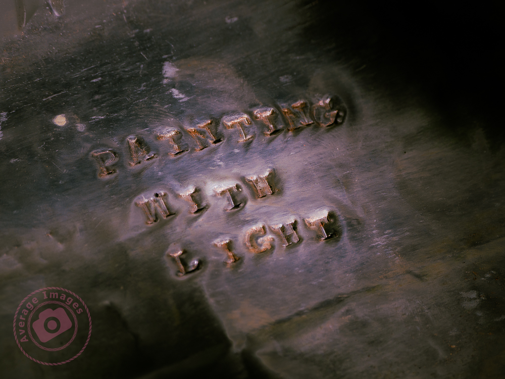
So, ‘that’s a wrap”, as I believe they say in the film industry. This is the final post in my Painting with light series, but before I sign off, here are some advanced tips and tricks to make your Painting with lightstand out from the crowd:
Don’t just shine your torch whilst standing behind your camera; the image will look flat and 2-dimensional. Move to the sides and paint the light from there. This will bring out shadows and texture to give the image depth.
Don’t paint the light from the same height every time. Stoop down or hold the torch above your head to vary the direction of the light beam. This will also give depth to the image.
Move the beam of light in strokes (a bit like a paintbrush) – slow, overlapping strokes to create brighter areas, and faster, sparser strokes for duller ones. The image will be far more interesting with varying intensities of light.
Keep the light moving at all times to reduce the chance of hot spots.
Remember that different surfaces react differently to the light; dark, rough surfaces require more lighting than pale, smooth ones.
Unless you are standing directly behind something solid, don’t point the torch back towards the camera otherwise you will create flare (or use a modifier).
Try to include some ambient light into outdoor images, maybe the faint glow of the sky, moonlight or stars.
Used coloured gels to create interesting variations in the lighting of your image.
And some post-processing tips:
Take many shots of small areas of the scene to create multiple layers – you can then adjust each one individually to create a detailed final image.
Create a layer mask for each layer and paint out everything other than the torch-lit area. This gives you full control of each element of the final image.
Vary the opacity to reduce the brightness of each layer to change how imposing they are in the final image.
Create an individual adjustment layer for specific layers so that you can change the exposure, contrast, light balance and even colour.
Keep your monitor clean. When working with very dark images, every smear or speck of dust shows up – and I’ve lost track of how many times I’ve tried to remove a blemish using Photoshop only to find out it’s actually on my monitor!
You can keep up-to-date with all of my blog posts by subscribing for free to receive updates via your email inbox or the Reader app:
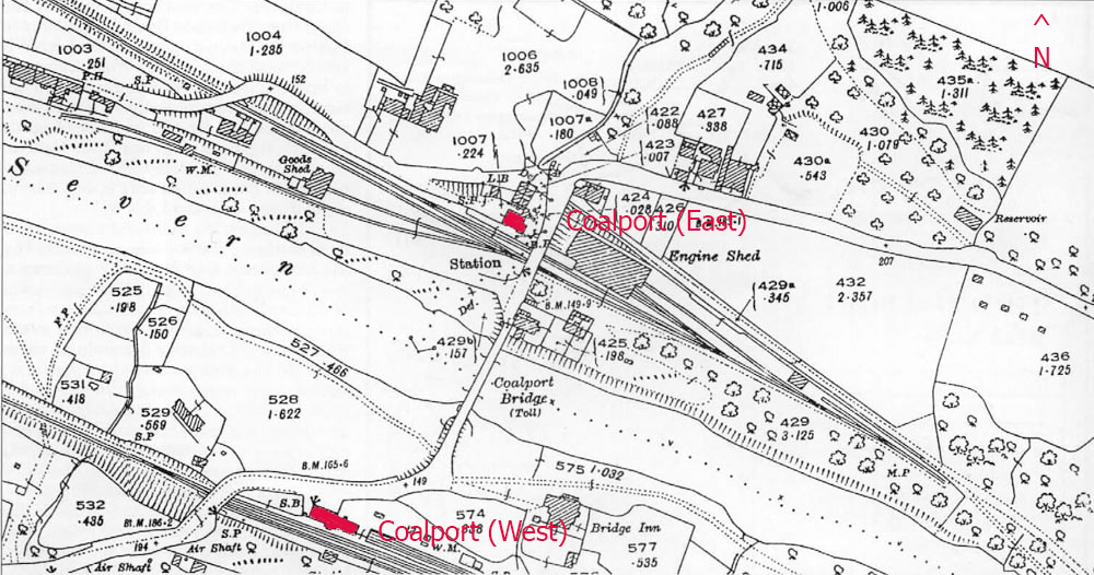
Considering that Coalport is only a small village, you may find it surprising that it had two railway stations.
I have already mentioned Coalport (East) in my post Secret Ironbridge: London & North Western Railway – but directly on the opposite side of the river (in the Coalport hamlet of Preens Eddy) was another station – Coalport (West) – which served the Great Western Railway (GWR) that ran from Kidderminster & Bridgnorth, and onwards to Ironbridge & Shrewsbury.
“Confused? – you will be“. If you look at the map (above)from 1925 you will see that Coalport (East) is only slightly in a more easterly direction than its counterpart. If I had been in charge of station names I would have been tempted to call them Coalport (North) and Coalport (South) – not least to eliminate the confusion that the line from Coalport (East) only takes you West! Maybe there is a station-naming protocol that I am unaware of. If so, please let me know.
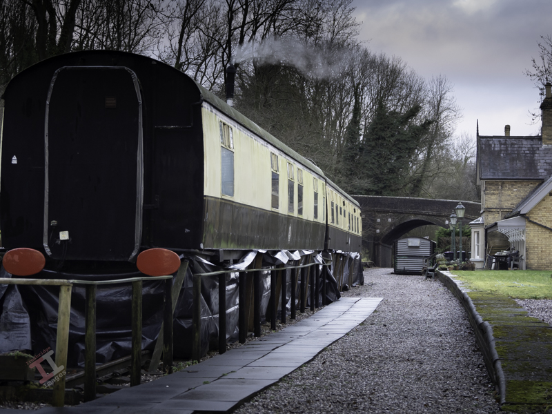
The old GWR railway track has long been removed, although the original course of the line can be clearly seen, and most of it is now a footpath called the Severn Valley Way. The station, however, still stands and has been tastefully converted into a house. In addition, two Mark1 railway carriages stand on tracks near the platform and are let out as self-catering holiday accommodation.
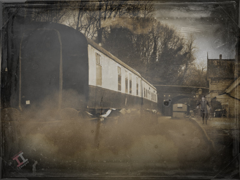
Coalport (West) station in its heyday, circa 1900.
Just west of the station is Sweyney bridge, which carries the road from the Coalport to Broseley, and is still an important route to the river crossing mentioned in Secret Ironbridge: Another bridge of iron.
Back in 2003, I conducted a small project called “Bridges of the Ironbridge Gorge”, when I photographed all 25 of them, ranging from the iconic Iron Bridge over the river Severn to a much smaller footbridge that crosses the Shropshire canal. The (then) owners of Coalport (West) Station kindly allowed me onto their land to capture the shot below to help complete the project:
Sweyney Bridge in 2003. Note the complex curvature of the abutment to allow the road to sweep over it.
And now – an admission. The ‘old’ photograph above is not “Coalport (West) station in its heyday”, it is actually a photograph I took a couple of weeks ago (from public land) and manipulated in Photoshop for a bit of fun.The lack of any railway tracks and the AI station master may be a bit of a clue.
We’ll be seeing more of the GWR line as we follow it up the Ironbridge Gorge to uncover some more Secret Ironbridge, including a lost village and the site of a nasty accident.
Continuing with our Painting with light post-processing; now that you have all of the individual images displayed as layers (see Painting with light: Light duties), we can start blending them together. This is the fun part, and it is fascinating to turn individual layers on and off to see their effect on the overall composition. Bear in mind that the post-processing may take some time (maybe hours), and that you may even want to leave it for a day or so, and then go back to it to rethink how it looks. Make sure you save the file often so you don’t lose all your hard work.
Germ warfare
You will, of course, need some post-processing software. Personally, I use Adobe Photoshop, but there are various other alternatives in different price brackets. It is a pre-requisite for creating composites that you need software that can work with layers, so that you can blend multiple images together. You also need a computer with plenty of Random Access Memory (RAM) because working with layers (I often blend 20 or more together to create one composite) can slow your computer down considerably.
This isn’t a tutorial on using a specific post-processing program, and so I am not going to indicate which key to press to achieve a specific action. I’m going to assume that you have a decent grasp of the program that you use – and that you understand layers, masks and blending modes, although you only need a small number of options to create a Painting with light (hopefully, you have read my blog post: Painting with light: Bringing to light – an introduction to layers, blending modes and layer masks).
I am going to assume that you have followed my earlier blog post: Painting with light: Light duties, and so you have all of the chosen images in layers, all in order and with visibility switched off, on all but the background layer.
The first step is to ensure that the background layer is exactly as you want it – because this will be the foundation onto which all the other layers sit. You need to make sure that any parts of that background layer that are not required (light overspill, for example) are removed. If you need to carry out adjustments, it is always better to create a duplicate layer and then add a layer mask to that, rather than adding it to the original background layer. In this way, the original is always untouched.
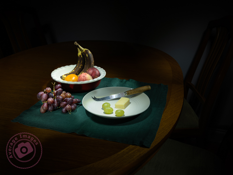
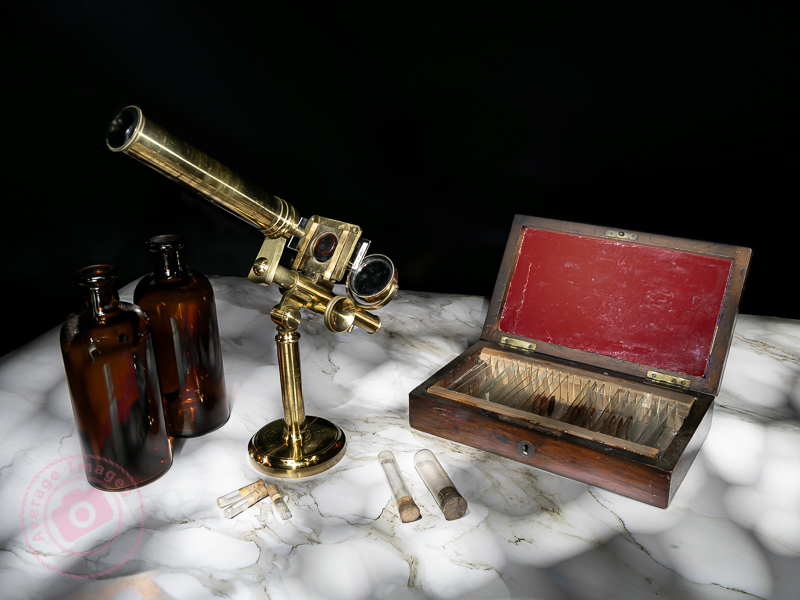
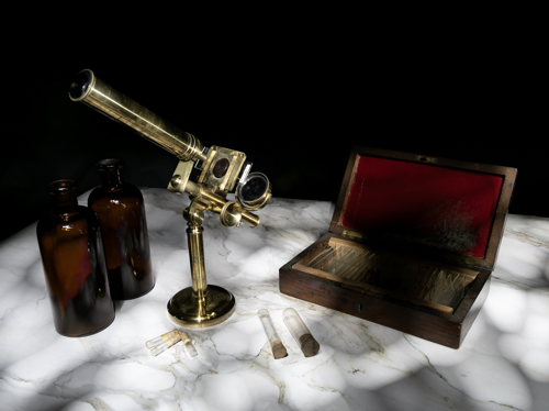
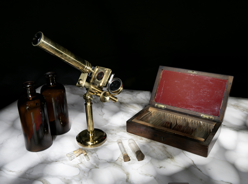
This was the layer I chose as the background. I adjusted the exposure so that the marble-effect table-top was correct, ignoring the rest of the image, knowing that I was going to add to it later.
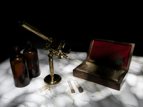
Once you are happy with the background layer you can start adding more layers to it. Choose the next layer (usually the next one up the list of layers in the layer panel) and turn its visibility on. It will immediately cover the background layer, hiding it from view.
Go to the ‘blending mode’ drop-down box and choose ‘lighten’. This will show the background layer again, and with it, all of the light areas from the new layer, ignoring its darker, shadowed areas.
Again, add a layer mask and use a black brush on the mask to remove any areas of the new layer that are not wanted.
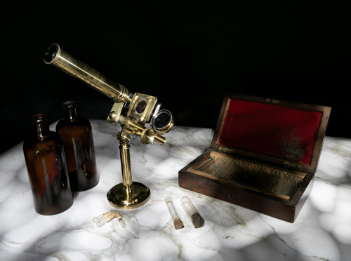
I chose the layer with the correctly-exposed microscope as my second layer, because this is the ‘hero’ of the shot.
There was some overspill of light on the bottles and the microscope base and so I added a layer mask and, with a black brush, removed that areas of the layer that I didn’t like.
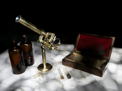
Here you can see my layers ready to be added. Only the bottom two are currently visible, as denoted by the ‘eye’ icon. You can also see the layer mask applied to the second layer.
The same shot after the layer mask had been addedand the extraneous light removed.
I then added a more subtle layer (I had deliberately created some vertical light reflections in the bottles using the wand tool).
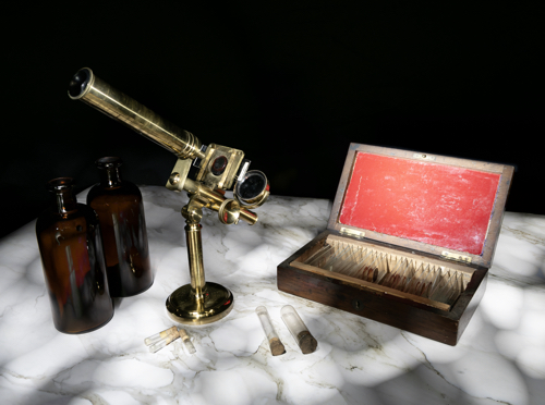
Now I added a layer that had the red box lid exposed.
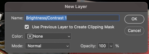
It was just too bright, and so I added a brightness/contract adjustment layer, making sure that I checked the box to clip it to that layer only, rather than the entire composite.
Instead of using an adjustment layer I could have lowered the intensity by using the Opacity slider. Either way, the result is a more balance image.
I continued adding and adjusting layers from the 15 images that I took in total. Many of the layers weren’t used because they didn’t add anything to the final vision of what I was trying to achieve.
If I was short on storage space or my computer was running slowly, I could have deleted the unused layers, but I chose to keep them just in case I change my mind later.
Remember, that each layer can be revisited and re-adjusted later on, so it is not critical that you get it right the first time – and as the composite builds up with more layers, you may find that earlier layers need to be adjusted to suit.
Finally you can save the completed composite as a single, merged layer. At this point you may want to crop it, adjust the overall exposure or add vignettes, for example.
We are nearing the end of the Painting with light series now (just one more blog post to go). I am surprised that this isn’t a more popular genre of photography, particularly for still-life imagery, given its ease and low cost compared with studio lighting set-ups, and that it is a good learning curve for layers, blending modes and layer masks, but I will leave the entire series published for those few who want to give it a try.
As mentioned in earlier Painting with light blog posts, it is easier to take multiple exposures and then blend them together during post-processing, than to try and capture the scene in one shot. However, this assumes a basic knowledge of some post-processing tools, namely; layers, blending modes and layer masks. Knowing how to use them is useful in all genres of photography, not just Painting with light, and so it is worth having a go.
The first part of this blog post is actually taken from a series of post-processing tutorials that I published on a previous incarnation of this web site way back in 2008. It just goes to show that, although the interface of programs such as Photoshop may have changed, the basic principles still remain.
Layers:
Imagine that you have a photographic print lying on the table in front of you (we can call this the background image). Now place a clear sheet of glass on top of the print and write some text onto the sheet of glass.
As you look down you see both the original image on the print – and the text – as if it were one. But the print itself is exactly as it was and has not been altered in any way. You change the text on the glass, move it so that the text is in a different position, or delete the glass altogether; all without affecting the original print.
Now add a second sheet of glass over the first one – but a sheet of glass with a grey tint to it.
Now, as you look down, you see a darker image than before, because the grey glass has darkened the appearance of the original print and the text on the first piece of glass. You can still go back to the first piece of glass and alter the text or move its position. If you don’t like the darker version you can take the second piece of glass and throw it away. If you want the original print darker but the text with the original exposure you can swap the order of the sheets of glass, so that the text layer is on top.
This analogy describes how layers work. They can be altered individually to change the overall appearance of the image, but it is non-destructive, and so the original image remains untouched at all times.
Blending modes:
Blending modes dictate how a layer interacts with the layers beneath it.
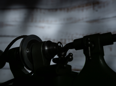
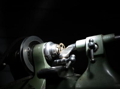
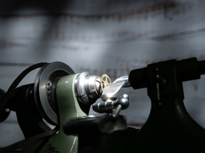
For example; Here we have the first ‘background’ image from my earlier shot of the small lathe. The background is correctly exposed, with the lathe itself completely in shadow.
If we add another layer over the top, which has the lathe correctly exposed but the background in darkness, it completely covers the background layer below, almost as if it doesn’t exist.
By choosing the ‘lighten‘ blending mode, it allows all of the light areas from the background layer to show through, to blend with the uppermost layer.
Of course, the above example is only blending two layers together, but you can blend an unlimited number – which is how we can build up a Painting with light composite.
There are lots of different blending modes (26 of them in Photoshop), all of which have their own individual uses depending on the type of image that you are processing and the effect that you are after. However, for Painting with light you will nearly always need the ‘lighten’ blending mode.
Layer masks:
So what if you actually don’t want to see part of a layer at all? This is where layer masks come into play. As the name implies, it masks part of a layer.
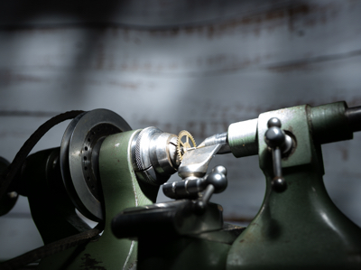
For example: If we don’t want to see the right-hand side of the lathe as lit by the torch, we open a layer mask and, with a black brush, paint over that section.
This then allows the layer beneath (in this case, the background image) to show through. This is very useful in Painting with light because you can mask out any light overspill on individual layers.
Note that here we haven’t actually painted onto the image, but only onto the mask, allowing the original exposure to show through.
I think that Painting with light is an ideal way to understand how layers, blending modes and layer masks work together, because it is a step-by-step process and very easy to see how one layer interacts with another, and in the next blog post of this series I will go through the entire process from start to finish on one image. Once you get to grips with layers, blending modes and layer masks, you can take them forward into other genres of your photography.
The above is only a very brief description of layers, blending modes and layer masks, because it would be impossible to provide full details in the space available here. If you want to learn more, there are plenty of websites, books and YouTube videos available to guide you on how to use your particular processing program.
Once you have completed your set of Painting with lightimages, you can import those images from your camera into your chosen post-processing software. If you use presets during the import process, ensure they apply to every image in the set.
Personally, I import into Adobe Lightroom. I can then quickly scan through the images and delete duplicates or apparent failures. It is crucial at this stage not to crop any of the images or make any adjustments that will make it difficult to blend in with the others (white balance, for example) later on.
Because I will be using multiple images and blending them into one composite, I need to work with layers – and since Lightroom cannot do that (yet), I transfer the chosen images into Adobe Photoshop for the actual creation of the composite. To do this, I select them all, right-click and choose ‘Edit in Photoshop as individual layers’. This will open Photoshop with all the shots as one file in a series of layers created from each torch-lit shot.
At this point, you can do some housekeeping of the layers. For example, change the order they show or label them with identifying names. You also need to switch off the visibility of all layers (apart from your background layer) so that you can build up the composite one by one.
As you save this file in Photoshop during post-processing, it will automatically show in Lightroom, making it very handy for subsequent cataloguing and exporting. I will cover the post-processing in the next blog post.
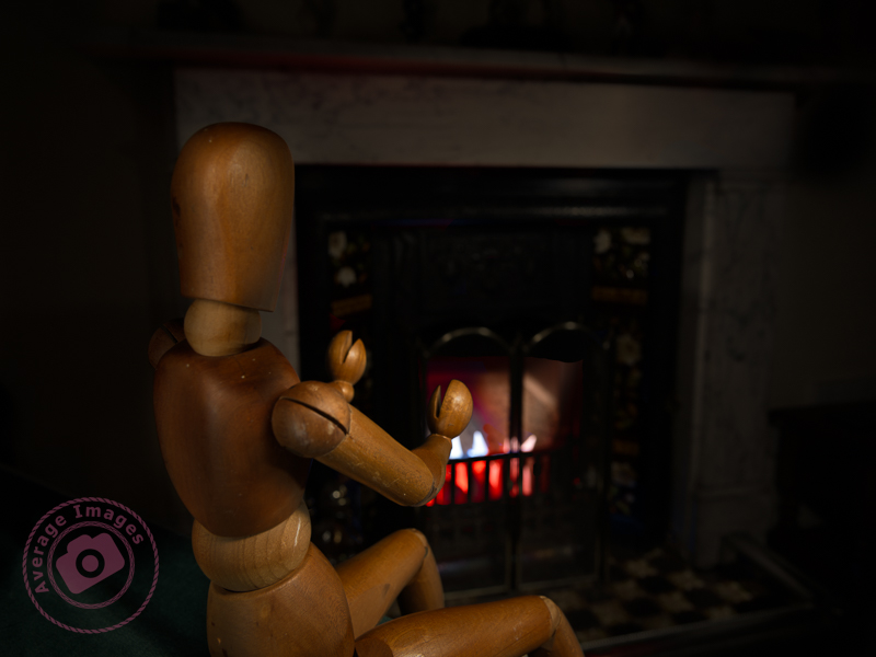
The featured shot “Warm hands” uses a phenomena called ‘Extension Distortion‘, which is a type of perspective distortion caused by wide angle lenses. It makes nearby objects appear much larger than they actually are compared to the background. I used it here to make the mannequin (which is only 40cm tall) look life-size, compared with the large fireplace behind, by using a 30mm focal length, with the camera positioned quite close to the subject.
We stopped using the fireplace last year due to smokeless fuel (which is pretty much all that you can get now) burning so badly, and giving out so little heat, that it isn’t worth the time and effort lighting it. Therefore, to give the effect of a blazing fire, I placed some white paper into the fire grate and used coloured gels over the torch as I painted the light onto it.
This is one of the benefits of the Painting with light process – it would have been challenging to create the same effect with studio lighting.
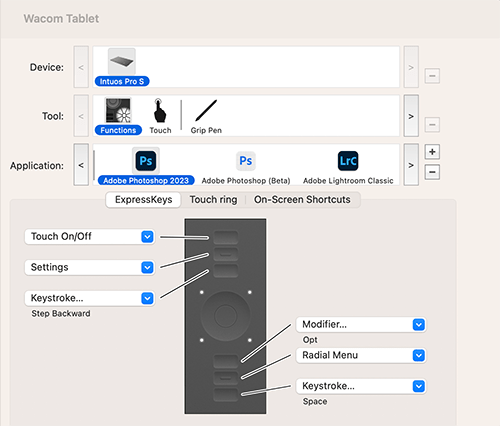
As you may have gathered from my post Warning Light I have recently purchased a Wacom Intuos Pro graphics tablet to aid with my Painting with light composite post-processing. I chose to buy the ‘small’ version which has a working area of 6.3 x 3.9 inches (160mm x 100mm). To me, this is a more than adequate size to be able to work without moving my hand around too much, and is pretty much the same area that a mouse covers on a mouse mat. Even so, the actual tablet itself is still about the size of a piece of A4 paper, and I have seen numerous reports from people who have bought the (larger) medium size and then wished they had gone for the small instead for precisely these reasons. Bigger isn’t always better!
Note: There is a difference between a graphics tablet and a drawing tablet. Graphics tablets have no screen, and you need to work with a computer monitor to see what you are doing. Drawing tablets have their own screen, and so you can work directly on them.
Wacom Intuos Pro (S)
The tablet itself plugs into the computer via a supplied USB cable (it can work via Bluetooth but then you have to purchase an optional battery) but the pen requires no batteries or charging. There is a nicely weighted stand for the pen (it advises against standing the pen up in storage to prevent wear & damage of the nib) which also acts as a storage compartment for a range of spare nibs and a nib removal tool. There are black nibs, white nibs and a spring-loaded nib – I have no idea what the difference is between them but will try them out in due course. There is also a handy storage bag to keep the surface of the tablet dust-free when not in use.
Wacom Tablet software
The driver and software are simply downloaded from the Wacom website and allow a multitude of customisations to the way that the tablet & pen work and feel. So far I have pretty much left it at its factory settings but maybe after prolonged use I may feel the need to add some customisation. Interestingly, you can have different customised settings for different programs; so you can have one set for Photoshop and another for Lightroom, for example.
I still find that I instinctively use my mouse and so I’ll really have to make the effort to use the tablet until it becomes second nature.
For my Painting with lightcomposites, I use Adobe Photoshop to blend two or more images together, but I often find that using a mouse is not very accurate – which can be annoying, especially when making detailed adjustments. I was therefore toying with the idea of buying a graphics tablet – but a decent Wacom Intuos Pro is £200 just for the small one, which is a lot to spend if I subsequently found I didn’t get on with it (I should mention at this point that many years ago I had a graphics tablet but never really used it – although I wasn’t using Photoshop in the same manner back then, and it was only a cheap one).
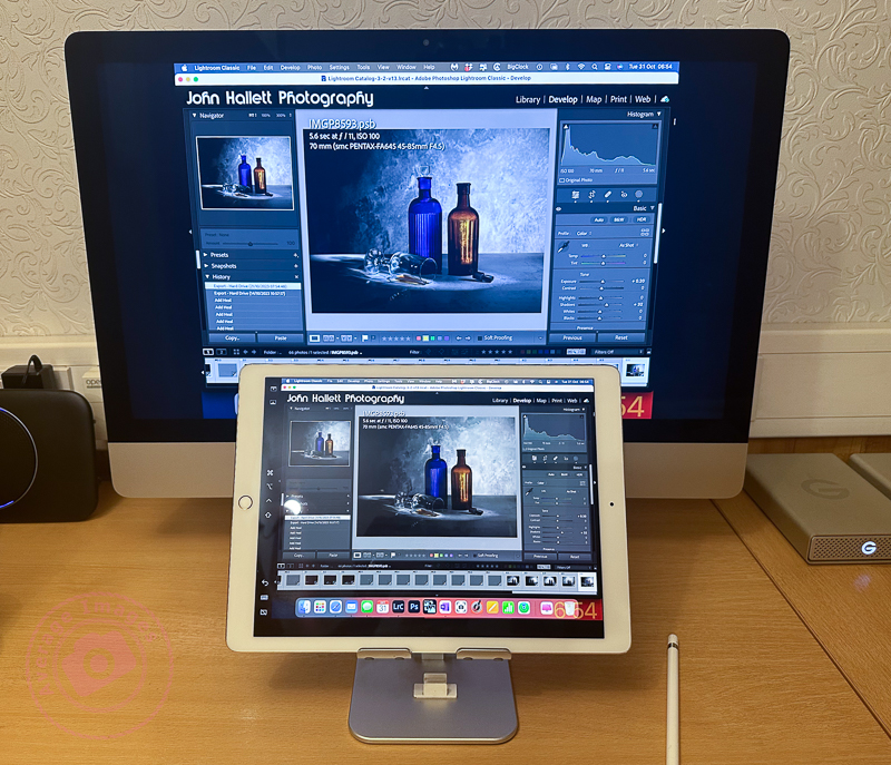
As I was reviewing alternative models, it reminded me that I could use my iPad, not only as a second display but also as a second input – thus also utilising my underused Apple Pencil. Now I had already tried this before and was less than impressed. However, I had heard that the process has improved with later software upgrades, so I decided it was worth another try.
These are the minimum requirements in case you are considering trying the same thing: You will need to be running MacOS Catalina or above on your main computer and iPadOS 13 or above on your iPad.
As soon as I tried it, I remembered why I didn’t like it the first time. If I set the iPad as a duplicate monitor, the aspect size on the primary monitor changed to suit the aspect size of the tablet. The program screens also moved into new positions, which meant relocating them before starting. The editing itself worked OK once everything was in the correct position (see below) but it was somewhat disconcerting to have the program screens a different size and position from normal. If I set the iPad as a secondary monitor, I then had to drag Photoshop onto the tablet and do the editing on that. Although the Apple Pencil gave much better precision than a mouse, I was now working on a much smaller screen – which was all somewhat counterintuitive.
Duplicating the monitor on an iPad
The other problems were that the Apple Pencil isn’t detected until it actually touches the screen, which means you are working ‘blind’ when trying to locate the pencil on the image to start editing (this is worst when using the duplicate monitor setting, and you are using the pencil on the iPad but looking at the image on the primary monitor) – and that the area being edited by the pencil didn’t seem to match the position of the cursor exactly which created some error when making fine adjustments.
Unfortunately, despite trying hard to make it work (I really wanted to find a good use for the Apple Pencil), I ultimately decided there were too many compromises. I therefore took the plunge and ordered a Wacom Intuos Pro. Look out for the follow-up blog post to find out how I got on.