Painting with light: A trick of the light

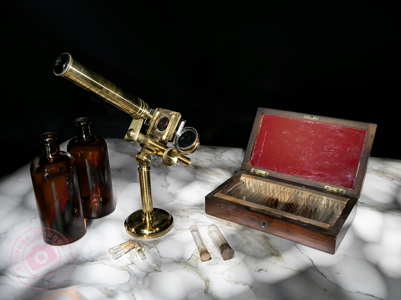
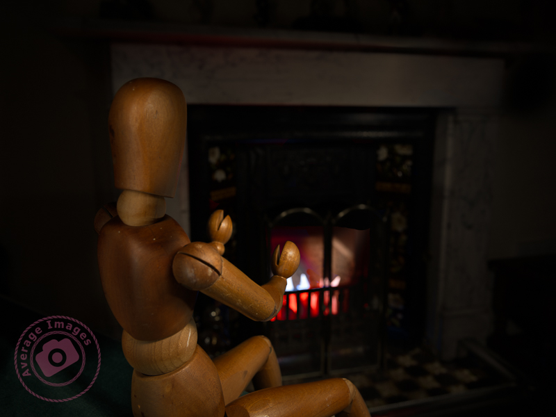
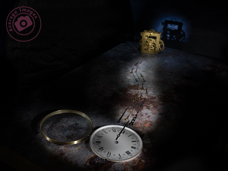
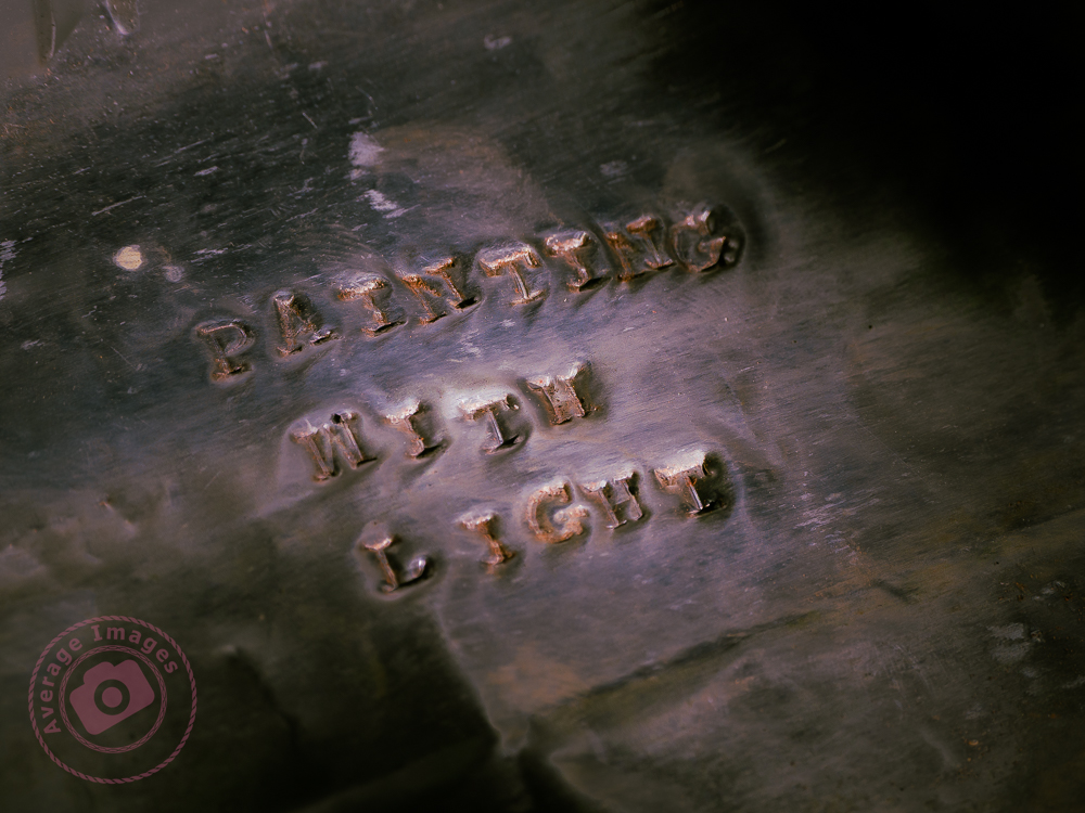
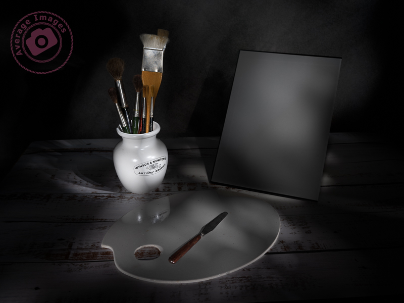
So, ‘that’s a wrap”, as I believe they say in the film industry. This is the final post in my Painting with light series, but before I sign off, here are some advanced tips and tricks to make your Painting with light stand out from the crowd:

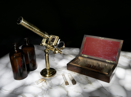
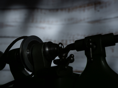
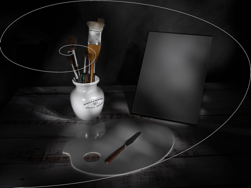
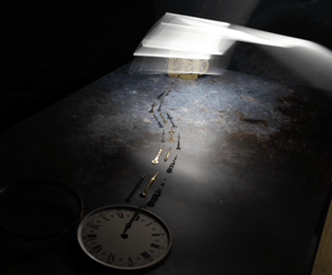
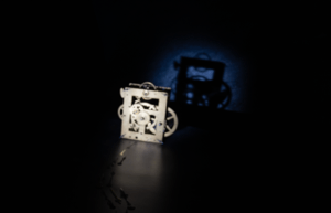
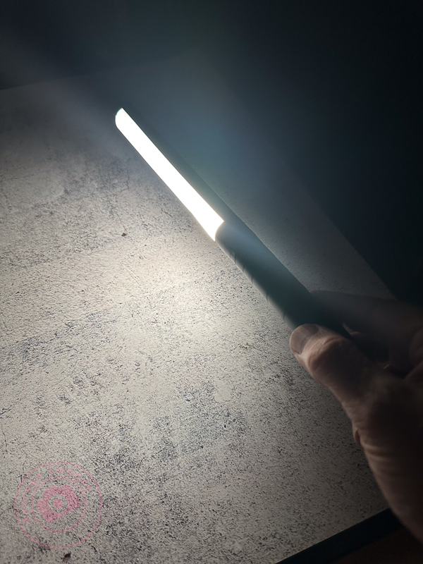
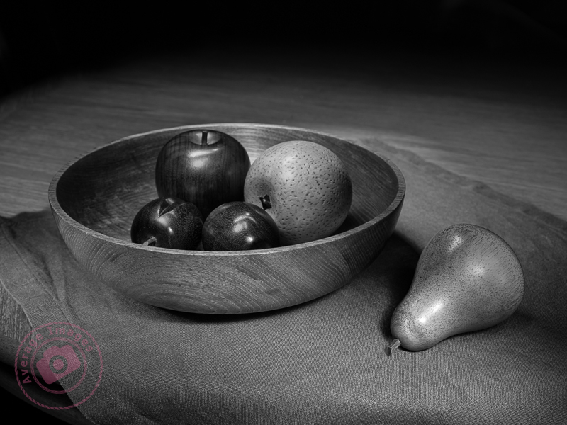
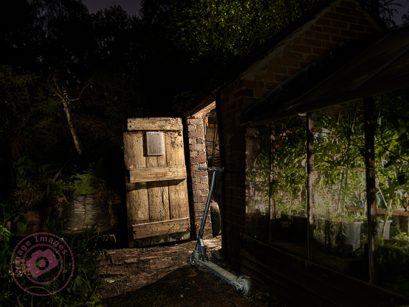
  • Don’t just shine your torch whilst standing behind your camera; the image will look flat and 2-dimensional. Move to the sides and paint the light from there. This will bring out shadows and texture to give the image depth.
  • Don’t paint the light from the same height every time. Stoop down or hold the torch above your head to vary the direction of the light beam. This will also give depth to the image.
  • Move the beam of light in strokes (a bit like a paintbrush) – slow, overlapping strokes to create brighter areas, and faster, sparser strokes for duller ones. The image will be far more interesting with varying intensities of light.
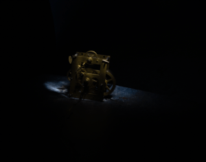
  • Keep the light moving at all times to reduce the chance of hot spots.
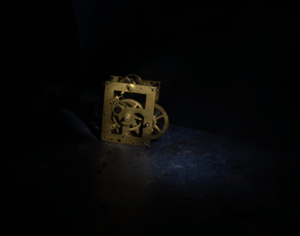
  • Remember that different surfaces react differently to the light; dark, rough surfaces require more lighting than pale, smooth ones.
  • Unless you are standing directly behind something solid, don’t point the torch back towards the camera otherwise you will create flare (or use a modifier).
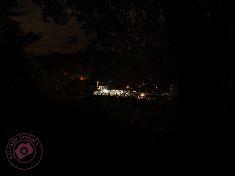
  • Try to include some ambient light into outdoor images, maybe the faint glow of the sky, moonlight or stars.
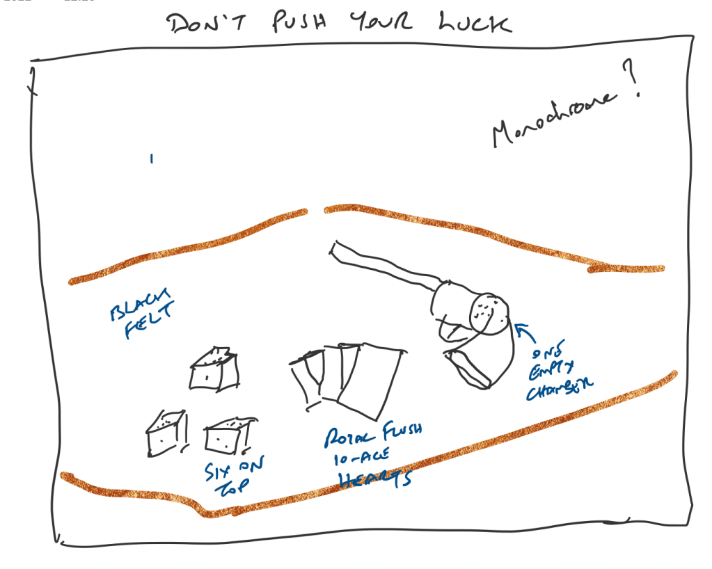
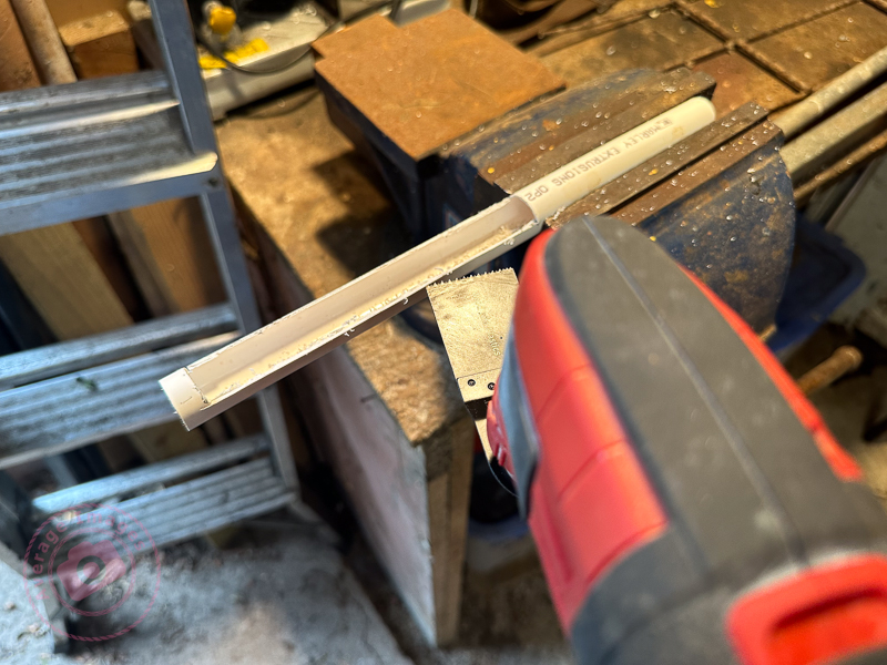
  • Used coloured gels to create interesting variations in the lighting of your image.

And some post-processing tips:

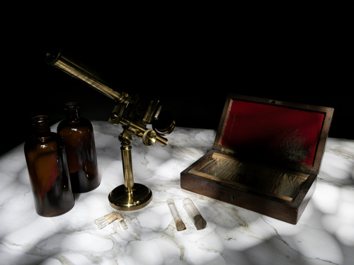
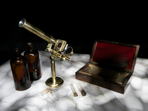
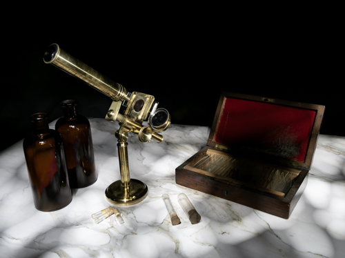
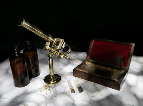
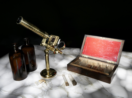
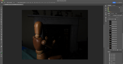
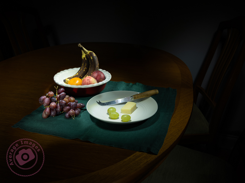
  • Take many shots of small areas of the scene to create multiple layers – you can then adjust each one individually to create a detailed final image.
  • Create a layer mask for each layer and paint out everything other than the torch-lit area. This gives you full control of each element of the final image.
  • Vary the opacity to reduce the brightness of each layer to change how imposing they are in the final image.
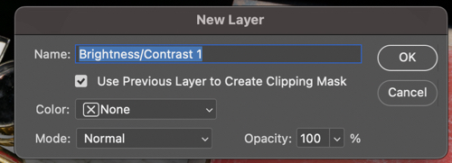
  • Create an individual adjustment layer for specific layers so that you can change the exposure, contrast, light balance and even colour.
  • Keep your monitor clean. When working with very dark images, every smear or speck of dust shows up โ€“ and I’ve lost track of how many times I’ve tried to remove a blemish using Photoshop only to find out it’s actually on my monitor!

You can keep up-to-date with all of my blog posts by subscribing for free to receive updates via your email inbox or the Reader app:

Painting with light: Light at the end of the tunnel

Continuing with our Painting with light post-processing; now that you have all of the individual images displayed as layers (see Painting with light: Light duties), we can start blending them together. This is the fun part, and it is fascinating to turn individual layers on and off to see their effect on the overall composition. Bear in mind that the post-processing may take some time (maybe hours), and that you may even want to leave it for a day or so, and then go back to it to rethink how it looks. Make sure you save the file often so you don’t lose all your hard work.

Germ warfare

You will, of course, need some post-processing software. Personally, I use Adobe Photoshop, but there are various other alternatives in different price brackets. It is a pre-requisite for creating composites that you need software that can work with layers, so that you can blend multiple images together. You also need a computer with plenty of Random Access Memory (RAM) because working with layers (I often blend 20 or more together to create one composite) can slow your computer down considerably.

This isn’t a tutorial on using a specific post-processing program, and so I am not going to indicate which key to press to achieve a specific action. I’m going to assume that you have a decent grasp of the program that you use – and that you understand layers, masks and blending modes, although you only need a small number of options to create a Painting with light (hopefully, you have read my blog post: Painting with light: Bringing to light – an introduction to layers, blending modes and layer masks).

I am going to assume that you have followed my earlier blog post: Painting with light: Light duties, and so you have all of the chosen images in layers, all in order and with visibility switched off, on all but the background layer.

The first step is to ensure that the background layer is exactly as you want it – because this will be the foundation onto which all the other layers sit. You need to make sure that any parts of that background layer that are not required (light overspill, for example) are removed. If you need to carry out adjustments, it is always better to create a duplicate layer and then add a layer mask to that, rather than adding it to the original background layer. In this way, the original is always untouched.

This was the layer I chose as the background. I adjusted the exposure so that the marble-effect table-top was correct, ignoring the rest of the image, knowing that I was going to add to it later.

Once you are happy with the background layer you can start adding more layers to it. Choose the next layer (usually the next one up the list of layers in the layer panel) and turn its visibility on. It will immediately cover the background layer, hiding it from view.

Go to the ‘blending mode’ drop-down box and choose ‘lighten’. This will show the background layer again, and with it, all of the light areas from the new layer, ignoring its darker, shadowed areas.

Again, add a layer mask and use a black brush on the mask to remove any areas of the new layer that are not wanted.

I chose the layer with the correctly-exposed microscope as my second layer, because this is the ‘hero’ of the shot.

There was some overspill of light on the bottles and the microscope base and so I added a layer mask and, with a black brush, removed that areas of the layer that I didn’t like.

Here you can see my layers ready to be added. Only the bottom two are currently visible, as denoted by the ‘eye’ icon. You can also see the layer mask applied to the second layer.

The same shot after the layer mask had been added and the extraneous light removed.

I then added a more subtle layer (I had deliberately created some vertical light reflections in the bottles using the wand tool).

Now I added a layer that had the red box lid exposed.

It was just too bright, and so I added a brightness/contract adjustment layer, making sure that I checked the box to clip it to that layer only, rather than the entire composite.

Instead of using an adjustment layer I could have lowered the intensity by using the Opacity slider. Either way, the result is a more balance image.

I continued adding and adjusting layers from the 15 images that I took in total. Many of the layers weren’t used because they didn’t add anything to the final vision of what I was trying to achieve.

If I was short on storage space or my computer was running slowly, I could have deleted the unused layers, but I chose to keep them just in case I change my mind later.

Remember, that each layer can be revisited and re-adjusted later on, so it is not critical that you get it right the first time – and as the composite builds up with more layers, you may find that earlier layers need to be adjusted to suit.

Finally you can save the completed composite as a single, merged layer. At this point you may want to crop it, adjust the overall exposure or add vignettes, for example.

We are nearing the end of the Painting with light series now (just one more blog post to go). I am surprised that this isn’t a more popular genre of photography, particularly for still-life imagery, given its ease andโ€‚low cost compared with studio lighting set-ups, and that it is a good learning curve for layers, blending modes and layer masks, but I will leave the entire series published for those few who want to give it a try.

Painting with light: Bringing to light

As mentioned in earlier Painting with light blog posts, it is easier to take multiple exposures and then blend them together during post-processing, than to try and capture the scene in one shot. However, this assumes a basic knowledge of some post-processing tools, namely; layers, blending modes and layer masks. Knowing how to use them is useful in all genres of photography, not just Painting with light, and so it is worth having a go.

The first part of this blog post is actually taken from a series of post-processing tutorials that I published on a previous incarnation of this web site way back in 2008. It just goes to show that, although the interface of programs such as Photoshop may have changed, the basic principles still remain.


Layers:

Imagine that you have a photographic print lying on the table in front of you (we can call this the background image). Now place a clear sheet of glass on top of the print and write some text onto the sheet of glass.

As you look down you see both the original image on the print – and the text – as if it were one. But the print itself is exactly as it was and has not been altered in any way. You change the text on the glass, move it so that the text is in a different position, or delete the glass altogether; all without affecting the original print.

Now add a second sheet of glass over the first one – but a sheet of glass with a grey tint to it.

Now, as you look down, you see a darker image than before, because the grey glass has darkened the appearance of the original print and the text on the first piece of glass. You can still go back to the first piece of glass and alter the text or move its position. If you don’t like the darker version you can take the second piece of glass and throw it away. If you want the original print darker but the text with the original exposure you can swap the order of the sheets of glass, so that the text layer is on top.

This analogy describes how layers work. They can be altered individually to change the overall appearance of the image, but it is non-destructive, and so the original image remains untouched at all times.


Blending modes:

Blending modes dictate how a layer interacts with the layers beneath it.

For example; Here we have the first ‘background’ image from my earlier shot of the small lathe. The background is correctly exposed, with the lathe itself completely in shadow.

If we add another layer over the top, which has the lathe correctly exposed but the background in darkness, it completely covers the background layer below, almost as if it doesn’t exist.

By choosing the ‘lighten‘ blending mode, it allows all of the light areas from the background layer to show through, to blend with the uppermost layer.

Of course, the above example is only blending two layers together, but you can blend an unlimited number – which is how we can build up a Painting with light composite.

There are lots of different blending modes (26 of them in Photoshop), all of which have their own individual uses depending on the type of image that you are processing and the effect that you are after. However, for Painting with light you will nearly always need the ‘lighten’ blending mode.


Layer masks:

So what if you actually don’t want to see part of a layer at all? This is where layer masks come into play. As the name implies, it masks part of a layer.

For example: If we don’t want to see the right-hand side of the lathe as lit by the torch, we open a layer mask and, with a black brush, paint over that section.

This then allows the layer beneath (in this case, the background image) to show through. This is very useful in Painting with light because you can mask out any light overspill on individual layers.

Note that here we haven’t actually painted onto the image, but only onto the mask, allowing the original exposure to show through.

I think that Painting with light is an ideal way to understand how layers, blending modes and layer masks work together, because it is a step-by-step process and very easy to see how one layer interacts with another, and in the next blog post of this series I will go through the entire process from start to finish on one image. Once you get to grips with layers, blending modes and layer masks, you can take them forward into other genres of your photography.

The above is only a very brief description of layers, blending modes and layer masks, because it would be impossible to provide full details in the space available here. If you want to learn more, there are plenty of websites, books and YouTube videos available to guide you on how to use your particular processing program.

Painting with light: Turn light

Lighting a close-up with Painting with light is far more difficult than with a still life or landscape shot – it is very easy to over-expose the shot and far more difficult to limit the amount of light over-spilling onto an adjacent area. For the shot below, I only managed 6 shots before I had lit every area, compared with over 20 in some of my earlier blog post shots. I used my small snoot tool, but possibly need to create an even smaller one for future close-up shots.

Other than that, Painting with light for close-up (or macro) shots is pretty much the same as with a landscape: take multiple shots with different areas lit, and then combine the shots in post-processing.


I have an old bench-top lathe that belonged to my father (who was a watchmaker) that he utilised to turn down new watch cogs when a direct replacement wasn’t available. It was his pride and joy for many years, and my mother used to joke that if he ever left home, the first thing that he would pack would be his lathe.

I decided, for this shot, to photograph a close-up of the lathe with a small watch cog and use the Painting with light technique to illuminate the scene. At the same time, I wanted to try out a function on my Olympus E-M1 Mark iii, called Live Time.

Live Time allows you to watch the exposure gradually develop on the Live View screen. Basically you use the cameras Bulb mode and press once to open the shutter, and press a second time to close it. When the shutter is open, you can shine your torch at the subject, whilst watching the screen to see how the exposure looks, in ‘live time‘. It worked quite well, albeit that the exposure times were quite short because of how close the light was to the subject. It may work better with still life shots, although not so effective with landscapes, when you need to leave the back of the camera in order to operate the torch.

There is another function on the camera called Live Composite. This works in a similar manner and is something that I will try out in a later blog post.

Painting with light: Light duties

Once you have completed your set of Painting with light images, you can import those images from your camera into your chosen post-processing software. If you use presets during the import process, ensure they apply to every image in the set.

Personally, I import into Adobe Lightroom. I can then quickly scan through the images and delete duplicates or apparent failures. It is crucial at this stage not to crop any of the images or make any adjustments that will make it difficult to blend in with the others (white balance, for example) later on.

Because I will be using multiple images and blending them into one composite, I need to work with layers – and since Lightroom cannot do that (yet), I transfer the chosen images into Adobe Photoshop for the actual creation of the composite. To do this, I select them all, right-click and choose ‘Edit in Photoshop as individual layers’. This will open Photoshop with all the shots as one file in a series of layers created from each torch-lit shot.

At this point, you can do some housekeeping of the layers. For example, change the order they show or label them with identifying names. You also need to switch off the visibility of all layers (apart from your background layer) so that you can build up the composite one by one.

As you save this file in Photoshop during post-processing, it will automatically show in Lightroom, making it very handy for subsequent cataloguing and exporting. I will cover the post-processing in the next blog post.


The featured shot “Warm hands” uses a phenomena called ‘Extension Distortion‘, which is a type of perspective distortion caused by wide angle lenses. It makes nearby objects appear much larger than they actually are compared to the background. I used it here to make the mannequin (which is only 40cm tall) look life-size, compared with the large fireplace behind, by using a 30mm focal length, with the camera positioned quite close to the subject.

We stopped using the fireplace last year due to smokeless fuel (which is pretty much all that you can get now) burning so badly, and giving out so little heat, that it isn’t worth the time and effort lighting it. Therefore, to give the effect of a blazing fire, I placed some white paper into the fire grate and used coloured gels over the torch as I painted the light onto it.

This is one of the benefits of the Painting with light process – it would have been challenging to create the same effect with studio lighting.

Painting with light: Rear light

When taking Painting with light landscape shots it is best to think like an artist (perhaps a painter), who first sets up a canvas on an easel before even starting to put paint onto the palette. Similarly, a landscape Painting with light often needs to have a background shot for the resulting composite on which all of the other shots will sit (you can think of this as the canvas on which you are going to work).

This initial (background) image is unlikely to be completely black – you may want the sky to be lighter to show the silhouette of trees, or to see the moonlight, or the stars. The rest of the images you take will be completely black, all apart from the elements intentionally lit up by your torch.

So, how do we decide on what exposure settings to use to have a very dark background image, but not completely black? It is going to be largely by trial-and-error, because no two scenes are going to be the same. But with a low ISO (to minimise noise) the resultant shutter speed is going to be at least 30 seconds, maybe several minutes. Taking multiple shots at these shutter speeds to find the right one could take a long time.

The answer is to remember the six-stop rule. This simply states that:

Why is this important? Well, if you set your ISO to 6400 you can take some test shots quite quickly in order to find the optimum shutter speed (which will be seconds rather than minutes). You can then reset your camera to ISO 100 and use the same number, but this time as minutesand you will get the same overall exposure.

For example; if you have your camera set to ISO 6400 and, after a few shots, determine that the best exposure time is 2 seconds, when you reset your camera to ISO 100 you will need an exposure time of 2 minutes to achieve the same image.

I’m sure that there are many who will now be saying to themselves “Hold on, if I can get the same image in 2 seconds as I can in 2 minutes why would I bother?”. The answer is ‘Reduced noise‘. Remember, the background image isn’t going to be completely black, there should be elements of detail (clouds, tree silhouettes, etc.) that need to be as crisp and sharp as possible. This will be possible at ISO 100 but not so much at ISO 6400.

For the feature shot above, I wanted the sky to be visible above the horizon and so took that shot first. Fortunately it wasn’t too dark and so the test shot at ISO 6400 took half-a-second. I then re-set the ISO to 100 and took the another shot for half-a-minute. This created just enough light in the sky to act as my background shot.

Of course, once you have your background shot ‘in the bag’, you now have to concentrate on your ‘hero’ and ‘supporting cast’.

The feature shot above isn’t a painting with light in the true sense, because the hero (the public house) is already lit up with its own lights. To be honest, it really doesn’t work for me, but it helped illustrate the six-stop rule, which is why I used it.

Painting with light: Let there be light. And there was light.

A little while ago, I decided to try my hand at a bit of Painting with Light, reawakening my interest in photography, which was sadly waning. Little did I know how much there was to think about – there is certainly more to it than meets the eye.

As I have been going along, I have been writing blog posts showing my progress and detailing my findings. It now totals 14 separate posts and there are many more planned. Therefore I have put together a section of this website dedicated to them, and listed in order so that anyone interested can follow along.

It is called, unsurprisingly, Painting with Light, and a link to it can be found in the top menu bar. Each post, of course, will still appear on the front page as well.

Blank canvas

The feature shot, ‘Blank Canvas‘ was inspired, in part, by my image taken in Story behind the shot: The Art Journal and partly by a prop that I’ve had in my studio for some years. Art, particularly painting, has been in my family for as long as I can remember. My grandfather used to sketch all the time (see Story behind the shot: Sketches of Yesteryear), my grandmother painted, and so did my father (who was formally trained). This skill seems to have passed me by – although maybe my photography is the link in my genes.

Anyway, back to that prop, it is a pot used to store artists’ brushes. I have a collection of brushes stored in it, and so my idea was to have the pot and brushes next to an artist’s easel containing a blank canvas. I also have a small artist’s palette which, although well-used, would fill the foreground.

In reality, the easel was just too tall and would have left too much empty space at the top of the image. However, I did find a palette knife which I added to the scene to act as a leading line.

Hopefully, it is clear what is the hero of the shot and what is the supporting cast, although you may wonder why I have pointed the leading line of the palette knife to the canvas and not the pot. This is because I have used a compositional tool called The Fibonacci Spiral.

The Fibonacci Spiral is based on a mathematical formula known as the Golden Ratio. I won’t bore you with the details (you can easily find the explanation by searching on the internet) but this spiral occurs naturally in anything from the Milky Way, to snail shells, to the water running down the plughole in your bath. The interesting thing for photographers (or artists), is that it is a naturally pleasing way for the human eye to operate. Subconsciously, when you look at something, you don’t just look straight at it, you survey the scene first before focussing on the main point of interest – and studies of the eye have shown that this surveying of the scene follows the path of the Fibonacci Spiral.

If you use Lightroom in your post-processing workflow, you will find that the Fibonacci Spiral is one of the crop overlays. When you choose the crop tool in the Develop module, press the letter O and it will cycle through 9 different compositional guides, one of which is the aforementioned spiral. The position and orientation of the spiral may not be correct for your particular image and so if you press Shift + O it will cycle through all of the available options (8 in total).

Footnote: This was literally the last set of shots that I took with my Pentax medium format set-up before I sold it off and moved to my present Micro Four Thirds camera/lens combo. Fortunately, painting with light doesn’t necessitate the need for large sensor sizes and huge image resolutions, as I hope to show in later posts in this series.

If you want to follow this series about Painting with light, or you want to see more photographic titbits, then why don’t you subscribe (for free!) to get an email reminder:

Painting with light: Sweetness and light

As you may have gathered from my post Warning Light I have recently purchased a Wacom Intuos Pro graphics tablet to aid with my Painting with light composite post-processing. I chose to buy the ‘small’ version which has a working area of 6.3 x 3.9 inches (160mm x 100mm). To me, this is a more than adequate size to be able to work without moving my hand around too much, and is pretty much the same area that a mouse covers on a mouse mat. Even so, the actual tablet itself is still about the size of a piece of A4 paper, and I have seen numerous reports from people who have bought the (larger) medium size and then wished they had gone for the small instead for precisely these reasons. Bigger isn’t always better!

Note: There is a difference between a graphics tablet and a drawing tablet. Graphics tablets have no screen, and you need to work with a computer monitor to see what you are doing. Drawing tablets have their own screen, and so you can work directly on them.

Wacom Intuos Pro (S)

The tablet itself plugs into the computer via a supplied USB cable (it can work via Bluetooth but then you have to purchase an optional battery) but the pen requires no batteries or charging. There is a nicely weighted stand for the pen (it advises against standing the pen up in storage to prevent wear & damage of the nib) which also acts as a storage compartment for a range of spare nibs and a nib removal tool. There are black nibs, white nibs and a spring-loaded nib – I have no idea what the difference is between them but will try them out in due course. There is also a handy storage bag to keep the surface of the tablet dust-free when not in use.

Wacom Tablet software

The driver and software are simply downloaded from the Wacom website and allow a multitude of customisations to the way that the tablet & pen work and feel. So far I have pretty much left it at its factory settings but maybe after prolonged use I may feel the need to add some customisation. Interestingly, you can have different customised settings for different programs; so you can have one set for Photoshop and another for Lightroom, for example.

I still find that I instinctively use my mouse and so I’ll really have to make the effort to use the tablet until it becomes second nature.

Painting with light: Light entertainment

When taking Painting with light shots, it is best to think of it as a two-step process (even though there will inevitably be more than two shots). Step one is to take the initial image, which will be the ‘hero’ of the finished work. Step two is to take a series of shots with individual elements lit up within the scene. These will be the ‘supporting cast‘ to the hero, ultimately blending together to produce the final output.

In this shot, “Hands of time” the hero is clearly the clock movement, even though it is in the rear of the shot. The viewer’s eye needs to land on it, and the supporting cast (in this case, the clock face and the hands) are there to help. Using positioning, lighting and compositional techniques, you can ensure that the supporting cast doesn’t take the attention away from the hero while still adding support.

The first shots were taken with the clock movement in focus, each with the light shining from a different angle. These shots were later merged in Photoshop using blending modes and layer masks.

I then refocused on the clock hands and took several shots, adjusting the focus as I got closer to the clock face. I wasn’t concerned with the light spilling from my wand because all of that section of the image would be blocked out with a layer mask. It is essential to have the camera fixed firmly on a tripod so that it doesn’t move as you adjust the focus.

Once I had got to the foreground, I refocused again on the clock face and took several shots, which, again, were merged together with blending modes and layer masks.

The final shot was back at the clock movement again to create the shadow on the background. I actually forgot to refocus on the movement, but it didn’t matter because I removed that part of the image with a layer mask and just kept the shadow.

So in total, I took 23 shots but only used 13 of them in the final image. For me, the most entertaining part of Painting with light is that you never really know how each image will contribute to the overall composition until you add its layer in Photoshop. Some of them surprise me with the effect that they give, while others are underwhelming and can be ignored.

Note: All of the small images above are cropped for the purpose of the description. Each image, as taken, was full size.

Painting with light: Warning light

For my Painting with light composites, I use Adobe Photoshop to blend two or more images together, but I often find that using a mouse is not very accurate – which can be annoying, especially when making detailed adjustments. I was therefore toying with the idea of buying a graphics tablet – but a decent Wacom Intuos Pro is ยฃ200 just for the small one, which is a lot to spend if I subsequently found I didn’t get on with it (I should mention at this point that many years ago I had a graphics tablet but never really used it – although I wasn’t using Photoshop in the same manner back then, and it was only a cheap one).

As I was reviewing alternative models, it reminded me that I could use my iPad, not only as a second display but also as a second input – thus also utilising my underused Apple Pencil. Now I had already tried this before and was less than impressed. However, I had heard that the process has improved with later software upgrades, so I decided it was worth another try.

These are the minimum requirements in case you are considering trying the same thing: You will need to be running MacOS Catalina or above on your main computer and iPadOS 13 or above on your iPad.

As soon as I tried it, I remembered why I didn’t like it the first time. If I set the iPad as a duplicate monitor, the aspect size on the primary monitor changed to suit the aspect size of the tablet. The program screens also moved into new positions, which meant relocating them before starting. The editing itself worked OK once everything was in the correct position (see below) but it was somewhat disconcerting to have the program screens a different size and position from normal. If I set the iPad as a secondary monitor, I then had to drag Photoshop onto the tablet and do the editing on that. Although the Apple Pencil gave much better precision than a mouse, I was now working on a much smaller screen – which was all somewhat counterintuitive.

Duplicating the monitor on an iPad

The other problems were that the Apple Pencil isn’t detected until it actually touches the screen, which means you are working ‘blind’ when trying to locate the pencil on the image to start editing (this is worst when using the duplicate monitor setting, and you are using the pencil on the iPad but looking at the image on the primary monitor) – and that the area being edited by the pencil didn’t seem to match the position of the cursor exactly which created some error when making fine adjustments.

Unfortunately, despite trying hard to make it work (I really wanted to find a good use for the Apple Pencil), I ultimately decided there were too many compromises. I therefore took the plunge and ordered a Wacom Intuos Pro. Look out for the follow-up blog post to find out how I got on.

Painting with light: Light hearted

As stated in my last Painting with light blog post, there usually needs to be a hero to act as the heart, or focal point, of an image, whether it be a painting or a photograph.

A photograph showing the hero of the shot utilising compositional techniques to lead the viewers eye.
Climbing the academic ladder

In this shot ‘Climbing the academic ladder‘ the hero is clearly the mannequin, and so it was important to make sure that is was sharply in focus and lit well, to bring out the detail. This is a fairly simple shot; others may have far more content competing for attention, and so it is important to recognise what is the focal point of the shot, and make sure that it draws the eye, which may be achieved with quite subtle use of lighting, leading lines and other compositional techniques.

Here, the mannequin is aligned with a ‘third’ line and the main body is on the intersection of the vertical and horizontal ‘thirds’. Also, the mannequin is looking ‘in’ to the shot, rather than out of it. These are all long-standing compositional rules used by classic Greek architects, up to the present day.

When taking still life shots you really need to have an idea or a concept of what you want to achieve before you start. If you just walk into an empty studio with no preconceived thoughts of what you are going to photograph you are likely to leave with nothing.

This was another shot where I had sketched the idea first before I even set foot in the studio. It doesn’t matter if you deviate away from the original plan; it is just there as a foundation for the concept to be built upon. I use OneNote on my iPad for my conceptual sketches but you could just as easily use a good ‘old-fashioned’ paper notebook instead.

A conceptual sketch is important to avoid leaving the studio empty handed.
Conceptual sketch

Painting with light: Come on baby light my fire

Don’t push your luck

A Painting with light is composed of two separate compositional elements; the physical composition and the lighting composition.

The physical composition is the scene in front of you and, like any photography, there needs to be a subject and the same artistic ‘rules’ apply: leading lines, rule of thirds, etc.

I suggest that the best way to achieve a good physical composition in Painting with light is to take a test shot in the light so that you can see the elements within the frame and decide which needs to be lit later on. You can also miss some distractions in the darkness, which may spoil the composition but are only noticeable when you view the image on a large monitor.

The lighting composition is what you are going to add to the physical composition. In most other genres of photography, you are ‘seizing the moment’, but in Painting with light you are ‘creating the moment’. You need, therefore, to be able to visualise how the scene will look and how to use the physical elements in the scene to optimise that visualisation. This is not particularly one of my strong points, which is why I prefer to take multiple shots and then combine them together in post-processing. In this way, I can change the emphasis of individual elements as I build up the overall lighting composition. We will look at post-processing in later blog posts.

The hero and the supporting cast

This mantra is often used by still life and product photographers and uses the analogy of a theatre play or a movie that usually has a hero (or heroine) who is surrounded by others who give context to the situation (the supporting cast). Although the hero may be the centre of attention, they would be meaningless without the supporting cast. Neither is more important than the other.

And this is never more true than with Painting with light. There needs to be a subject (the hero) and then other elements within the shot, and the way that you light them, become the supporting cast.

An advantage of producing the final image as a composite of multiple shots is that you can vary the contribution of each of the ‘supporting cast’ so that a balanced image is created. The ‘hero’ will still be the main subject, but in a subtle manner, whilst each of the ‘supporting cast’ will have their own place as secondary interest in their own right.

Whether your composition works to create a great image is always a gamble; sometimes it will work, and sometimes it won’t, but don’t leave it to chance and put as much thought into it as possible.

This leads me nicely to my featured shot: “Don’t push your luck“. I find it useful to pre-plan compositions whenever I can and use Microsoft OneNote as a sketch pad, using my iPad and Apple Pencil. The ‘gun’ is actually a starting pistol (and totally harmless), and I purchased the dice and cards specifically for the shot. You can see that my original plan was to create a monochrome shot but, during post-processing, I decided that it worked better in colour.

The title of this post comes from the lyrics of the song ‘Light My Fire’, written and performed by the American rock band The Doors in the 1960s. There have been numerous cover versions since then, with Will Young’s release in 2002 being one of the most successful.

Remember, you can keep up-to-date with all of the Painting with light blog posts by subscribing:

Painting with light: Blinded by the light

Poisoned Chalice

As you do more Painting with light, you will probably start to discover some of the shortcomings of working with your torches – particularly doing still-life indoor shots when the beam of light may be too broad and too strong.

This is where light modifiers come in very handy. As the name implies, they modify the light from your torch to make it more suitable for the task at hand. Of course, you could buy a range of torches with different types of light beams, but that would be rather expensive, alternatively you can make the modifiers below very cheaply and easily.

Light fitting sleeve:

I do suggest that before you start making any light modifiers you think about how you are going to attach them to your torch. You may think that just holding them on, or taping them on each time, will be sufficient. But remember that you are going to be using them in the dark and, if outside, probably in the cold as well. Therefore try and choose a torch that will accept a tubular sleeve so that you can just slide it on and off.

In my case, I found a length of plastic conduit pipe in my shed, which had an inside diameter that exactly matched the diameter of my Scangrip Matchpen pen torch. It was long enough to be able to cut multiple lengths so that each of my modifiers can be permanently attached to one. If you aren’t fortunate enough to find a piece of tube of the correct diameter then use some cardboard core from inside a kitchen roll, cut it through lengthways and then roll it to the diameter that you need and tape it up.

Snoot:

A snoot is a funnel shape and narrows the light beam down to allow you to finely light individual areas for detail. These are easily made with card (or thick paper) rolled into a conical shape. The cone can then be simply cut with scissors to match the light fitting sleeve at one end and the size of the desired light opening at the other.

Shield:

If you are trying to back-light an object with the torch facing the camera you will get light trails showing in the image. To prevent this, make a shield which will hide the end of the torch. This is simply a flat, rectangular, piece of stiff card, attached to a light fitting sleeve. The size of the rectangle is largely down to personal preference.

Wand:

When doing still-life images and working quite closely to the subjects with your torch, it is easy to get ‘hot-spots’ of light, and very harsh shadows, which are difficult to blend in during post-processing. To prevent this, use a light wand – a long strip of diffused light, which you can ‘wave’ over the subjects. You can buy them, of course, but you can also make one very easily with just a few tools.

Take a length of white plastic tubing (look in the plumbing or electrical section of your local DIY store) and cut a suitable length that will attach to your torch but leave about 30cm for the actual light wand.

You then need to cut a slot down the length of the tube, whilst leaving the ends intact to maintain its shape. I used a multi-tool but you could use a sharp knife, if you are careful.

Don’t forget to seal the end of the tube to stop the light coming out

Cover the slot with a diffusing material (thin tracing paper or baking paper works well). Then wrap the rest of the tube with non-reflecting black tape. I used electrical insulating tape.

When using a light wand you will have to spend a lot more time than with your torch alone to get the same exposure, due to the light being diffused.

Prevent reflections:

In all cases, cover all of the outer surfaces of the modifier with black tape to prevent reflections on the surface being picked up during a long exposure.

The shot Poisoned Chalice (above) was lit using my set of modifiers to control the light. Curved glass is notoriously difficult to light successfully because it readily picks up reflections from any nearby light source and I found that painting with light (with modifiers) was considerably easier than using strobes in this situation.

“Blinded by the light’ was a song written and performed by Bruce Springsteen in the early 1970’s although it was subsequently sung (albeit modified) by Manfred Mann’s Earth Band, which is the version that most people recognise.

Painting with light: Black and light

Painting with light works very well in monochrome because the lack of colour in the image accentuates the tonal ranges between the light and dark areas. As with any monochrome image, the best ones work when you have pre-planned it, rather than those that you have desaturated just because they didn’t look good as a colour photograph.

Black & Light

You can buy cameras that only take monochrome photographs (examples include the Pentax K3-III Monochrome) or you may find a ‘black & white’ setting on your existing camera. Personally, I just take the images as normal but concentrate on the effect of the light and shadows, rather than the colour, and then desaturate the image in post-processing (usually using the ‘black & white’ module in Lightroom).

The subjects of this shot are actually life-sized wooden ornaments taken on a hastily rearranged dining room table, thus showing how easily you can create a studio-type setting using the Painting with light technique.

Remember, you can keep up-to-date with all of the Painting with light blog posts by subscribing:

Painting with light: Light of my life

In my last Painting with light blog post, Interior Light, I discussed taking photographs indoors. Within this category is a sub-genre of indoor art called ‘Still Life‘.

A ‘still life’ is a picture (painting, drawing or photograph) of an arrangement of inanimate objects, the purpose of which is to show a new way of looking at the ordinary things around us. Traditionally they tend to be composed of flowers, food or (dead) animals.

Still lifes are not new:

  • Egyptian burial sites dating from the 15th century BC contained paintings of crops and food.
  • The ancient Greeks and Romans created still life mosaics and frescoes.
  • Artists in the Middle Ages used still life to depict religious and Biblical scenes.
  • During the Renaissance period (15th-16th century) floral paintings became popular, as did the desire to depict everyday objects as realistically as possible.
  • The Modern Art movement often had table-top scenes with vases, wine bottles and fruit.

In photography, still life became popular from the early 19th century. One of the reasons for its popularity is that it is relatively easy to set up, without having to worry about the vagaries of people or the weather. However, much like any genre of photography, taking the photograph is the easy part and it is the setting of the scene which differentiates a great still life from a good one. This means careful positioning of the components with regards to general composition, leading lines, complementary colours and sometimes including a hidden meaning (for example, decaying subjects are often used to symbolise the fragility of life). It needs to be a piece of art rather than just a record shot.

A meagre lunch

Remember, you can keep up-to-date with all of the Painting with light blog posts by subscribing: