Painting with light: Come on baby light my fire

Don’t push your luck

A Painting with light is composed of two separate compositional elements; the physical composition and the lighting composition.

The physical composition is the scene in front of you and, like any photography, there needs to be a subject and the same artistic ‘rules’ apply: leading lines, rule of thirds, etc.

I suggest that the best way to achieve a good physical composition in Painting with light is to take a test shot in the light so that you can see the elements within the frame and decide which needs to be lit later on. You can also miss some distractions in the darkness, which may spoil the composition but are only noticeable when you view the image on a large monitor.

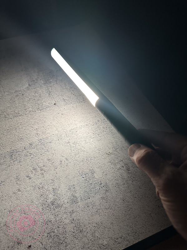
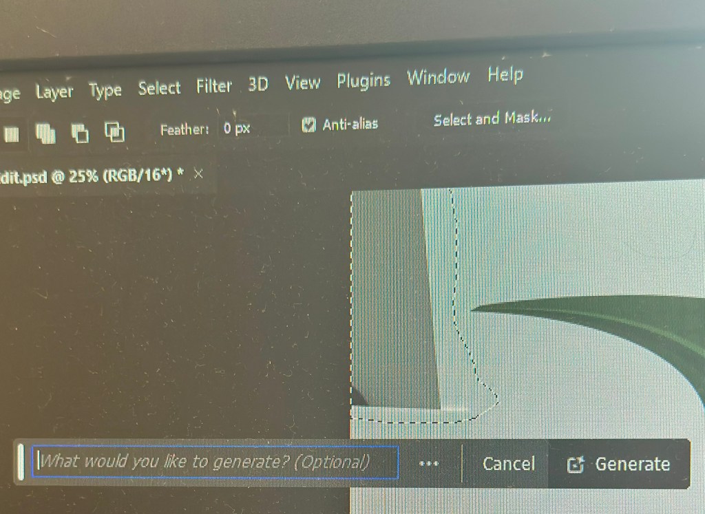
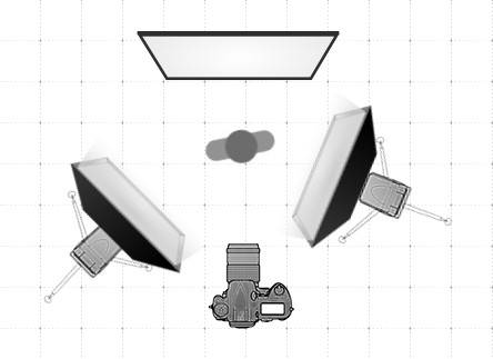
The lighting composition is what you are going to add to the physical composition. In most other genres of photography, you are ‘seizing the moment’, but in Painting with light you are ‘creating the moment’. You need, therefore, to be able to visualise how the scene will look and how to use the physical elements in the scene to optimise that visualisation. This is not particularly one of my strong points, which is why I prefer to take multiple shots and then combine them together in post-processing. In this way, I can change the emphasis of individual elements as I build up the overall lighting composition. We will look at post-processing in later blog posts.
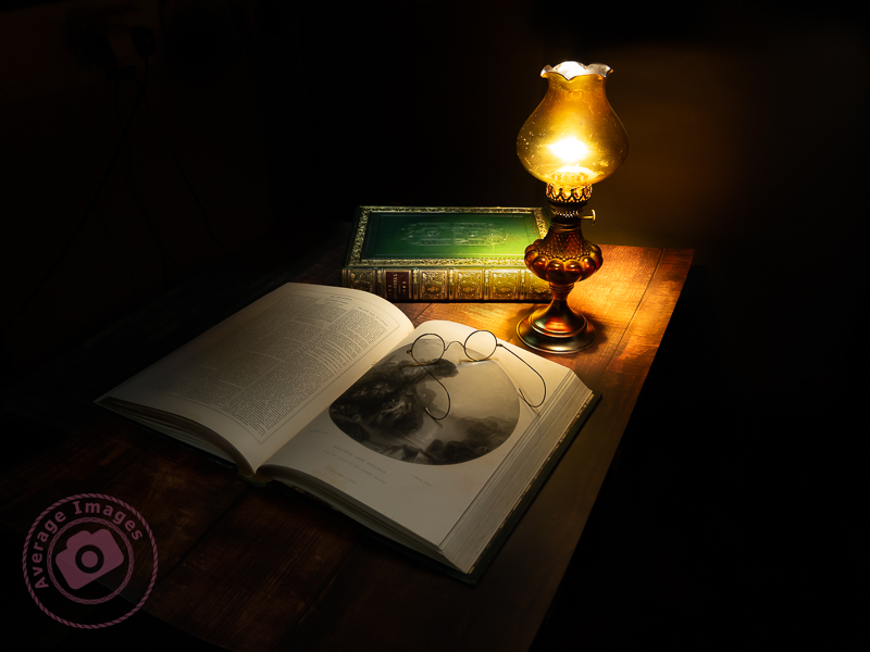
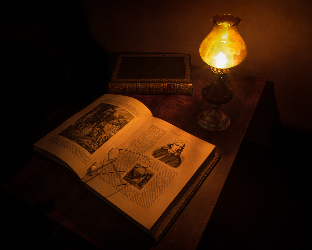
The hero and the supporting cast

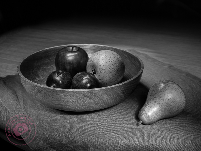
This mantra is often used by still life and product photographers and uses the analogy of a theatre play or a movie that usually has a hero (or heroine) who is surrounded by others who give context to the situation (the supporting cast). Although the hero may be the centre of attention, they would be meaningless without the supporting cast. Neither is more important than the other.

And this is never more true than with Painting with light. There needs to be a subject (the hero) and then other elements within the shot, and the way that you light them, become the supporting cast.

An advantage of producing the final image as a composite of multiple shots is that you can vary the contribution of each of the ‘supporting cast’ so that a balanced image is created. The ‘hero’ will still be the main subject, but in a subtle manner, whilst each of the ‘supporting cast’ will have their own place as secondary interest in their own right.

Whether your composition works to create a great image is always a gamble; sometimes it will work, and sometimes it won’t, but don’t leave it to chance and put as much thought into it as possible.

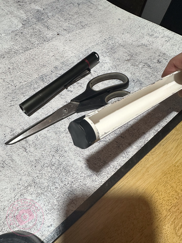
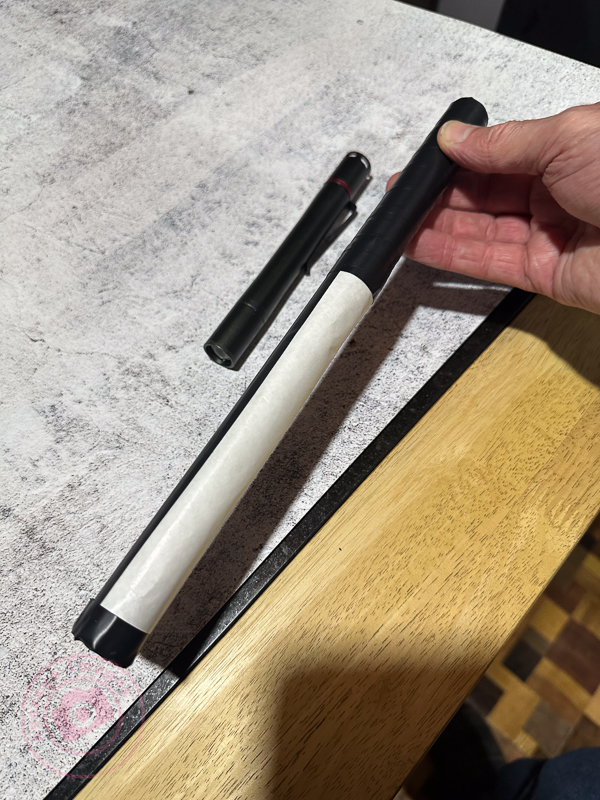
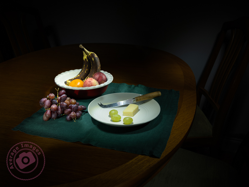
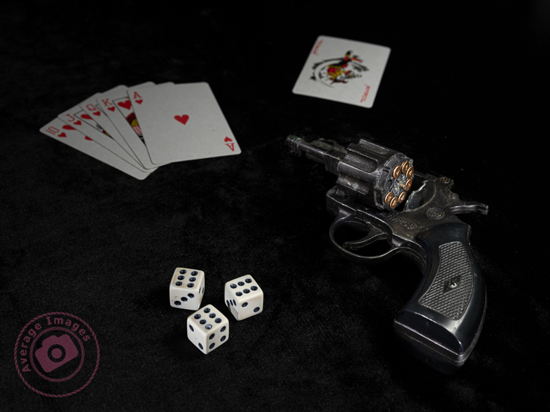
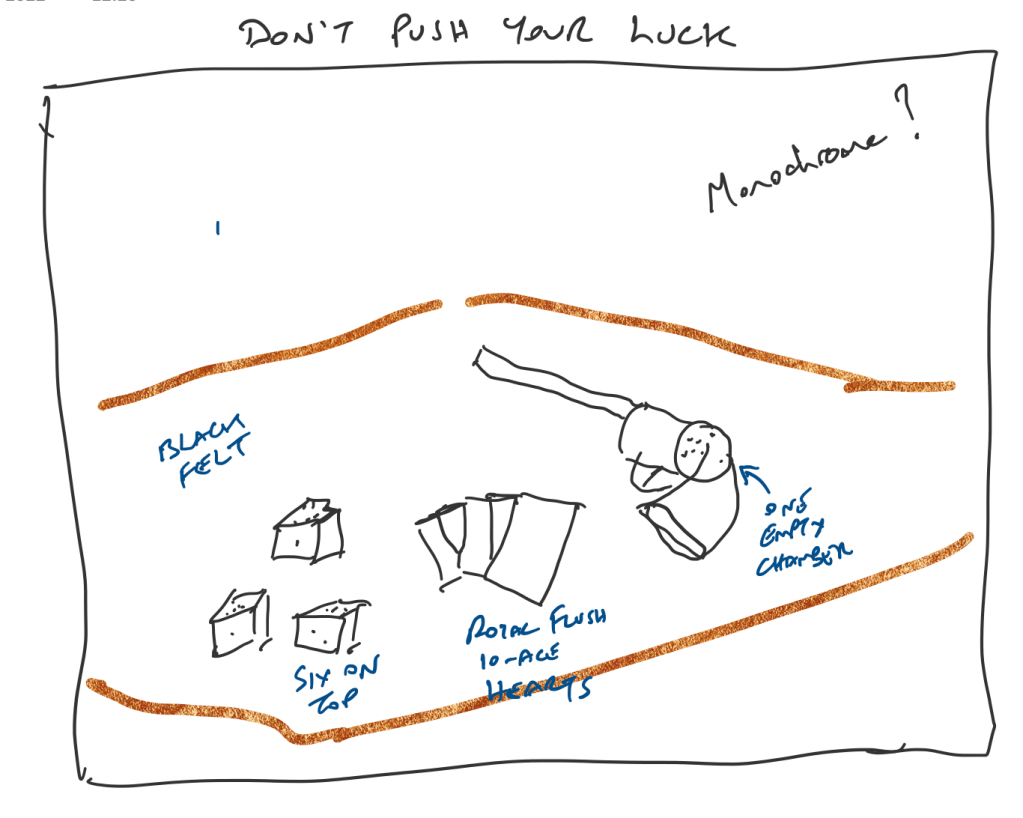
This leads me nicely to my featured shot: “Don’t push your luck“. I find it useful to pre-plan compositions whenever I can and use Microsoft OneNote as a sketch pad, using my iPad and Apple Pencil. The ‘gun’ is actually a starting pistol (and totally harmless), and I purchased the dice and cards specifically for the shot. You can see that my original plan was to create a monochrome shot but, during post-processing, I decided that it worked better in colour.

The title of this post comes from the lyrics of the song ‘Light My Fire’, written and performed by the American rock band The Doors in the 1960s. There have been numerous cover versions since then, with Will Young’s release in 2002 being one of the most successful.

Remember, you can keep up-to-date with all of the Painting with light blog posts by subscribing:

Painting with light: Blinded by the light

Poisoned Chalice

As you do more Painting with light, you will probably start to discover some of the shortcomings of working with your torches – particularly doing still-life indoor shots when the beam of light may be too broad and too strong.

This is where light modifiers come in very handy. As the name implies, they modify the light from your torch to make it more suitable for the task at hand. Of course, you could buy a range of torches with different types of light beams, but that would be rather expensive, alternatively you can make the modifiers below very cheaply and easily.

Light fitting sleeve:

I do suggest that before you start making any light modifiers you think about how you are going to attach them to your torch. You may think that just holding them on, or taping them on each time, will be sufficient. But remember that you are going to be using them in the dark and, if outside, probably in the cold as well. Therefore try and choose a torch that will accept a tubular sleeve so that you can just slide it on and off.

In my case, I found a length of plastic conduit pipe in my shed, which had an inside diameter that exactly matched the diameter of my Scangrip Matchpen pen torch. It was long enough to be able to cut multiple lengths so that each of my modifiers can be permanently attached to one. If you aren’t fortunate enough to find a piece of tube of the correct diameter then use some cardboard core from inside a kitchen roll, cut it through lengthways and then roll it to the diameter that you need and tape it up.

Snoot:

A snoot is a funnel shape and narrows the light beam down to allow you to finely light individual areas for detail. These are easily made with card (or thick paper) rolled into a conical shape. The cone can then be simply cut with scissors to match the light fitting sleeve at one end and the size of the desired light opening at the other.

Shield:

If you are trying to back-light an object with the torch facing the camera you will get light trails showing in the image. To prevent this, make a shield which will hide the end of the torch. This is simply a flat, rectangular, piece of stiff card, attached to a light fitting sleeve. The size of the rectangle is largely down to personal preference.

Wand:

When doing still-life images and working quite closely to the subjects with your torch, it is easy to get ‘hot-spots’ of light, and very harsh shadows, which are difficult to blend in during post-processing. To prevent this, use a light wand – a long strip of diffused light, which you can ‘wave’ over the subjects. You can buy them, of course, but you can also make one very easily with just a few tools.

Take a length of white plastic tubing (look in the plumbing or electrical section of your local DIY store) and cut a suitable length that will attach to your torch but leave about 30cm for the actual light wand.

You then need to cut a slot down the length of the tube, whilst leaving the ends intact to maintain its shape. I used a multi-tool but you could use a sharp knife, if you are careful.

Don’t forget to seal the end of the tube to stop the light coming out

Cover the slot with a diffusing material (thin tracing paper or baking paper works well). Then wrap the rest of the tube with non-reflecting black tape. I used electrical insulating tape.

When using a light wand you will have to spend a lot more time than with your torch alone to get the same exposure, due to the light being diffused.

Prevent reflections:

In all cases, cover all of the outer surfaces of the modifier with black tape to prevent reflections on the surface being picked up during a long exposure.

The shot Poisoned Chalice (above) was lit using my set of modifiers to control the light. Curved glass is notoriously difficult to light successfully because it readily picks up reflections from any nearby light source and I found that painting with light (with modifiers) was considerably easier than using strobes in this situation.

“Blinded by the light’ was a song written and performed by Bruce Springsteen in the early 1970’s although it was subsequently sung (albeit modified) by Manfred Mann’s Earth Band, which is the version that most people recognise.

Generation gap

In my previous blog post Panic at the packaging factory? I mentioned that I had used Photoshop to fill in the gaps in the upper corners of an image background. Due to the short time I had to finish the job, I used the eyedropper tool to sample the background colour and then painted in the corners using a brush. This worked fine because the background was almost white, and there was no significant colour gradient next to the area I needed to fill.

I was subsequently asked to create some similar shots and, with more time to do the post-processing, decided to try the Generative Fill option in Photoshop instead. This is a relatively new and powerful update, but what I wanted it to do was just the tip of the iceberg of what it can potentially add (or take away).

Generative Fill is available from Adobe Photoshop version 25.0 onwards.

As shot

With the image open in Photoshop, I needed to select the area with the missing background, so I chose the lasso tool and traced around as close as possible. As I completed the selection, the floating Contextual taskbar automatically changed to the Generative Fill taskbar.

Note: If you can’t see the Contextual taskbar then click on Window in the Menu bar and look towards the bottom of the long dropdown list and make sure that Contextual Task Bar is ticked.

I pressed the Generative Fill button and then the Generate button. By leaving the “What would you like to generate” box empty, Photoshop automatically filled the area with content based on its immediate surroundings.

It takes a little time but this is indicated by a progress bar.

It will then apply the generated content onto the image, but also give you another two variations in the Generative Layer panel to the right. You can press Generate again if you are not happy with the initial three offerings.

The generated image is applied as a layer so you can always go back and change it later if you want.

Generative Fill uses Artificial Intelligence (AI) to decide what to add to the image. In the case above it was used as a shortcut to fill in an area of missing background, but, of course, it could have been used to add something else entirely, maybe something that may be seen as being slightly dishonest. This is the conundrum facing photographers: what is acceptable and what is not? Of course, this is not a new phenomenon; the Cottingley Fairies photographs from 1917 are early examples of ‘generative fill’, albeit without sophisticated software.

Painting with light: Black and light

Painting with light works very well in monochrome because the lack of colour in the image accentuates the tonal ranges between the light and dark areas. As with any monochrome image, the best ones work when you have pre-planned it, rather than those that you have desaturated just because they didn’t look good as a colour photograph.

Black & Light

You can buy cameras that only take monochrome photographs (examples include the Pentax K3-III Monochrome) or you may find a ‘black & white’ setting on your existing camera. Personally, I just take the images as normal but concentrate on the effect of the light and shadows, rather than the colour, and then desaturate the image in post-processing (usually using the ‘black & white’ module in Lightroom).

The subjects of this shot are actually life-sized wooden ornaments taken on a hastily rearranged dining room table, thus showing how easily you can create a studio-type setting using the Painting with light technique.

Remember, you can keep up-to-date with all of the Painting with light blog posts by subscribing:

Panic at the packaging factory?

What do you do when you are asked to produce some marketing shots in an hour, and your photography gear is 5 miles away at home? Panic? No, improvise.

I used the camera in my pocket (my trusty iPhone), made a makeshift studio by setting up a table in one of the meeting rooms and purloined a marketing pop-up banner from the Sales department to use as a backdrop. It is 6 feet high, so I used some gaffer tape to allow it to remain ‘popped-up’ at a more practical 4 feet. It is also quite narrow and left areas on either side without any background, so I used some white foam board on both sides, knowing that I would need to blend them in during post-processing. I positioned the packaging samples in an arrangement that I thought was ‘artistic’ and used Portrait mode on the iPhone, which I know gives a good result for product shots, as well as people portraits.

Fortunately, I have both Lightroom and Photoshop on my laptop, and with two large monitors attached, I could do the post-processing immediately. Lightroom is more than adequate for these relatively simple edits, and I only used Photoshop to fill in the upper corners where there was no white background. For example, Lightroom’s healing brush made light work of removing the join between the two tables I used as a base.

As shot

The only slight faux pas was that when I emailed over the first proof, the comment I received back was that the editing of the background in the upper corners was noticeable. It had looked acceptable to me, but I quickly realised that the contrast on one of the monitors was set incorrectly and over-exposed my view during the post-processing. Once Lightroom was dragged over onto the other monitor, I could see the issue and was able to quickly adjust the exposure to rectify the problem.

Of course, it didn’t take long before I got the dreaded “while you are doing that, can you do this” and so I also ended up taking some individual shots ‘on white’. I used the two aforementioned foam boards in an ‘L’ configuration to make the background as light as possible and then, in Lightroom, used ‘select subject’, inverted it to select the background, and then over-exposed it to make the background completely white. Once again, Lightroom produced a result in seconds, formerly only possible in Photoshop. Five of the images are being used for a display stand at a forthcoming exhibition.

As shot
After Post Processing

Coincidentally, Lightroom had an update this week which added some more tools, including a beta version of lens blur. If only they could add layers, photographers wouldn’t need Photoshop at all.

Painting with light: Light of my life

In my last Painting with light blog post, Interior Light, I discussed taking photographs indoors. Within this category is a sub-genre of indoor art called ‘Still Life‘.

A ‘still life’ is a picture (painting, drawing or photograph) of an arrangement of inanimate objects, the purpose of which is to show a new way of looking at the ordinary things around us. Traditionally they tend to be composed of flowers, food or (dead) animals.

Still lifes are not new:

  • Egyptian burial sites dating from the 15th century BC contained paintings of crops and food.
  • The ancient Greeks and Romans created still life mosaics and frescoes.
  • Artists in the Middle Ages used still life to depict religious and Biblical scenes.
  • During the Renaissance period (15th-16th century) floral paintings became popular, as did the desire to depict everyday objects as realistically as possible.
  • The Modern Art movement often had table-top scenes with vases, wine bottles and fruit.

In photography, still life became popular from the early 19th century. One of the reasons for its popularity is that it is relatively easy to set up, without having to worry about the vagaries of people or the weather. However, much like any genre of photography, taking the photograph is the easy part and it is the setting of the scene which differentiates a great still life from a good one. This means careful positioning of the components with regards to general composition, leading lines, complementary colours and sometimes including a hidden meaning (for example, decaying subjects are often used to symbolise the fragility of life). It needs to be a piece of art rather than just a record shot.

A meagre lunch

Remember, you can keep up-to-date with all of the Painting with light blog posts by subscribing:

Painting with light: Interior light

Painting with light doesn’t always have to be done outside – you can also create some very interesting images indoors – and the good thing is that you don’t need a dedicated studio or any fancy studio lights, you can just do this on your kitchen table.

Late night reading

The first thing that you need is a dark room. You may think, in the daytime, that just closing the curtains will be enough, but as your eyes become accustomed you will notice that the room won’t be totally dark at all and there will be enough ambient light seeping in around the sides, top and bottom of the curtains to ruin a good light painting. The obvious solution is to do your indoor Painting with light at night or early morning (or spend a lot of time taping over the gaps around windows and doors).

The second consideration is the lights that you are going to use. The torches you use for outdoor Painting with light will be too big and too bright so you can either invest in a much smaller torch or create homemade ‘snoots’ for your large torch to funnel the light down to a smaller beam.

You can create a homemade snoot with a piece of dark-coloured card folded into a cone shape and then trimmed to suit the head of the torch. The bottom of the cone can then be trimmed to the hole size that you require. I will discuss light modifiers in a later blog post.

The actual image will be taken in the same way as you would outdoors, not forgetting to create an interesting composition for your still life. The good thing is that the physical size of an indoor shot is often going to be a lot smaller than an outdoor one, and so you usually need to take far fewer shots to capture the entire scene. This makes the post-processing into the final composite a lot quicker and easier.


The subject of the image featured in this blog post is actually a recreation of a recreation. If you check back on my blog post The Art Journal from March 2022, you will see that I describe how I replicated a previous shot of an oil lamp and some antique Art Journal compendiums because the original image had been lost. On both previous occasions, I had used a single light source from the lit oil lamp itself, which, although atmospheric, had created some deep shadows. In this second recreation, I decided to use Painting with light to illuminate the scene (and didn’t actually light the oil lamp at all). It is a composite image, with blending modes and layer masks combining just 4 individual shots (although I took 19 shots during the actual photoshoot just to be sure that I had illuminated every part of the scene). I have to say that I am pretty pleased with the result – the lighting is far more controlled than just using the oil lamp as a light source, and to try and achieve this effect using studio strobes would have been very time-consuming and complex.

Remember, you can keep up-to-date with all of the Painting with light blog posts by subscribing:

If I be waspish, best beware my sting

The title of this blog post is a quote from William Shakespeare’s “The Taming of the Shrew” and is a fairly weak introduction to this photograph of a wasps nest and the story behind it.

If I be waspish

It all started when I went into one of the garden sheds and noticed a wasps nest in the roof space. It was now December and the wasps would have abandoned it long ago but I still tapped it a few times with a stick just to make sure that there were no stragglers left behind (placing myself conveniently by the door just in case). It’s not often you can get so close to a fully-formed nest and so it seemed like a good photographic opportunity; trouble was it was in the rafters about 15 feet from the ground, there is little lighting in the shed, and in that position it would be little more than a record shot. I therefore decided to move it.

I put up some ladders and gently scraped the nest off the wooden rafters with a paint scraper so that it dropped gently into a cardboard box that I was holding. Although the nest is quite robust it is not at all hard and the closest analogy I can think of is that of a partially-deflated football. It is entirely constructed of a paper-like substance that the wasps create from wood and saliva, which I can imagine makes it quite warm inside.

So, with the nest safely ‘in the box’ it was time for me to develop a concept for the shot. A wasps nest generally brings a feeling of fear and trepidation, and instinctively you don’t want to touch it in case it awakens the stinging army within. So my concept was to build on this in terms of ‘an accident waiting to happen’ with a hand dangerously close to touching the nest. And why would a hand be there? Well maybe to operate a fuse box, often located in a roof void and rarely accessed.

Some photographers like to sketch a layout of a shot beforehand to pre-plan the composition and lighting; which is OK if you happen to be good at sketching. I’m not, and so I just created a mental picture in my head – whilst also contemplating the practicalities of the how to set the shot up. However, I now have a multitude of concepts for future still-life shoots in my head, the details of which are bound to get forgotten, and so I am toying with the idea of using my iPad and iPen to make some digital sketches on Microsoft OneNote (an app I mentioned in my blog post Note To Oneself back in April) to act as an ideas board. I will report back on how this works out.

To create the scene I hung the nest up near to the fuse box in the studio using a metal hook and clamp and lit it using a single strobe with a snoot and honeycomb diffuser (which seems to be my modifier of choice just at present, following the chiaroscuro theme). I wanted a high-contrast shot with dark, well-defined shadows – typical of the type of sharp lighting in a loft space from a torch. The only thing missing was a ‘hand’ and so the camera was positioned on a tripod with a remote shutter release so that I could extend my hand into the shot and fire the shutter at the same time.

With the shot taken it was time for some post-processing to further define the shadows and, with a bit of Photoshop editing, I added the image of a wasp head exiting from the bottom of the nest.

Danger rears its head

Back in Black

Those of a similar age and musical persuasion to myself will probably recognise the title of this blog post as an album by Australian rock band AC/DC released in 1980 (and not to be confused with the Amy Winehouse album Back to Black). However this is not about music but about creating studio photographs with the background in black (see what I did there?)

Back in black
Continue reading “Back in Black”

Bottoms up

The main table that I use in the studio was actually a ‘bar-style’ table (originally with two tall chairs). It has a removable marble centre-section and so some time ago I found a suitably-sized piece of sheet glass that could replace it, when required, so that I could light subjects from beneath. I even have a mini-light stand for just that purpose.

Finally it was time to try it and the obvious choice of subject was some coloured glass bottles that I have in my collection of still-life photography props.

Bottoms up
Continue reading “Bottoms up”

Black Piccolo

Back in the studio again now that the garden is tucked-up for the Winter.

A piccolo is a small flute in the woodwind section of an orchestra or military band and plays exactly one octave higher than a normal flute – being the highest pitched instrument in that section. When I was at school (many years ago!) I played the flute and piccolo (the one pictured here) in the school and county bands, although I haven’t played either since then.

Black Piccolo
Continue reading “Black Piccolo”

The Art Journal

This is the story behind a studio shot of an old 1851 Art Journal compendium.

The Art Journal

I have a small set of these compendiums from the years 1849-1862 that I purchased from my late Grandmothers estate and some time ago I took a photograph of one on a farmhouse table lit by an oil lamp. Unfortunately, the original RAW file of this shot was lost during ‘the catastrophic HDD failure of 2019‘ and the only copy I have left is a fairly small & low-resolution JPEG image from a previous version of my website.

Continue reading “The Art Journal”

Another balanced view

Here is a second shot of the pharmacy balance from a slightly different perspective. This is also a composite shot but in this case I didn’t have a background shot with a matching perspective and so I chose to use a textured ‘brick wall’ background instead.

1/100s, f/22, ISO100, 45mm, Composite

Hooked on composites

Here is another composite which combines a studio shot with a shot taken out-and-about. I am getting quite ‘hooked’ on doing these composites because with each one I am learning a little bit more about:

  • Planning the concept of the composite beforehand
  • Taking the studio shot in a way that will make the selection easier to cut out in post-processing.
  • Finding a background that complements the studio shot in respect to lighting & perspective.
  • Making the selection of the studio shot in post-processing such that it isn’t obviously cut-out when I remove the original background.
  • Adding a new background and blending it in.

Quite what the commercial rewards are for this type of shot remains to be seen but at least I’m enjoying the ride.

“Hooked”

The hook & chain has been hanging in one of our sheds for many years and probably came from an old industrial tramway that ran behind our property between a small clay mine and the nearby Blists Hill brickworks. It looks as if it may have been used to connect the narrow-gauge goods wagons to each other which I’m assuming were horse-drawn. The site of the Blists Hill brickworks is now a Victorian Town museum which, coincidentally, was where I took the background shot during my ‘Day at the museum‘.

I hung the hook & chain to an overhead wire in front of my 18% neutral-grey collapsible background. It was an easy shot to take lit either side by two strobes each fitted with 28″ x 20″ softbox. The selection was made in post-processing and an image of a re-creation of a Victorian iron foundry was processed as the background.

Pharmacy Balance (part 1 – taking the shot)

The pharmacy balance had been originally rescued when clearing out my grandparents house. My grandfather had been a pharmacist back in the days when they used to mix the medicines themselves in a back room of a chemist shop and so a balance was a necessity. In fact clearly so important to him that he had kept them until the end of his life.

They had clearly seen better days. I am sure that they had been looked after meticulously during their working life but not so well during storage and so the brasswork was dirty and the wood veneer peeling. If there hadn’t been a sentimental value attached to them I’m sure they would have just ended up in a bin.

I had a plan to take a photograph of them that was hatched back in the middle of 2021 and so I stripped them apart completely and started what could be loosely called a restoration. With the wood polished as best as possible and the brasswork cleaned they looked acceptable and so the photograph was ready to stage.

The plan involved creating a composite photograph with the balance in one shot and a pharmacy background in another. The background shot has already been taken during my day at the museum photoshoot some months previously and so the first part of the staging was to erect a mid-grey (18%) collapsible background behind my shooting table which would make the selection of the subject easier in Photoshop later. Then I chose a marble-effect covering for the table and placed the balance on top (I guessed that a Victorian pharmacy probably had marble worktops). I also had some of the original brass weights and so I placed one of them on the ‘weight’ side of the balance and poured sugar onto the ‘sample’ side to get them to ‘balance’.

It was at this point that I realised how accurate these old balances are. It seemed that it only took a few grains of sugar for it to go from ‘too little’ to ‘too much’ and it took about 10 attempts to get the correct quantity – with an emptying and cleaning of the glass dish each time (trying to remove sugar already in the dish with a spoon left an unsightly divot in the otherwise smooth heap).

Once the balance was set-up and balanced I just had to decide on the camera height for the shot and then rotate the balance to the optimum viewing angle. With the camera tethered to a laptop the first trial shots could be taken and the power of the studio strobes adjusted to achieve an acceptable exposure. To prevent unsightly dark shadows I lit both sides with softbox diffusers.

Once the shots were taken (with a few taken at a different camera height as well) it was time to import them into Lightroom and Photoshop to create the composite. But that’s a story for another day. Here is the finished shot:

“Pharmacy Balance” 1/100s, f/22, ISO100