Secret Ironbridge: London & North Western Railway

If you travel into the Ironbridge Gorge from the town of Madeley, you will pass down a road called Legges Way, named after George Legge, who owned the Blists Hill brickworks from 1912 to 1938.

Although it may not be immediately apparent, the first part of this road is actually laid over the bed of the London & North Western Railway (LNWR), one of three railway lines that once ran into the Ironbridge Gorge. This branch left the main Wellington to Stafford line and ran down to Coalport (East) station and its terminus.

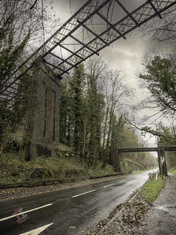
After travelling down Legges Way for less than a half-mile, you will see two bridges crossing the road. The much taller one is called the Lee Dingle Bridge, built in the 1860s with impressive, tall, blue abutments carrying a lattice-girder frame. It was designed to carry a tramway, carrying coal from the nearby Meadow Pit colliery to the Blists Hill ironworks. Initially, it was painted cream, then blue, and it was much later in the 1960s when it was overpainted with its current grey colour. The smaller one was built as a footbridge when the railway was built, probably to allow workers to reach the Blists Hill ironworks and brickworks from Madeley town.

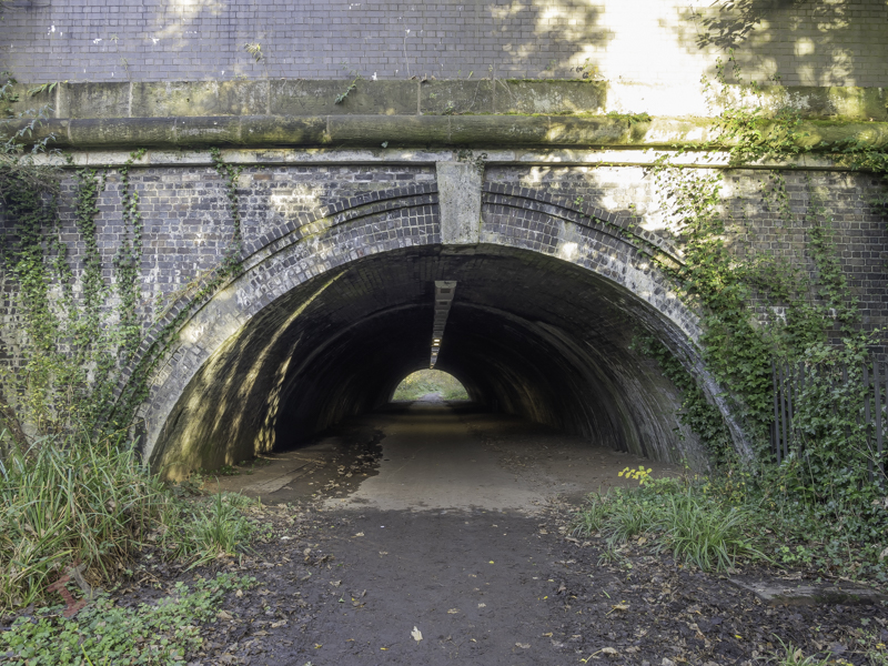
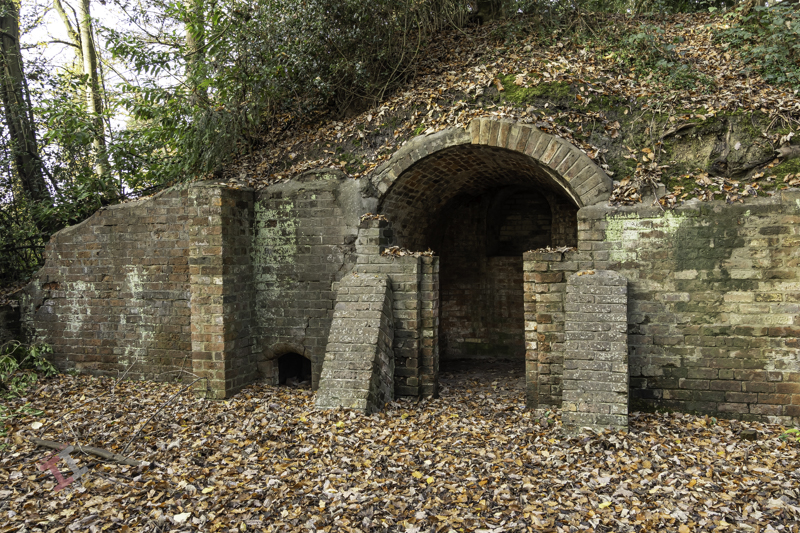
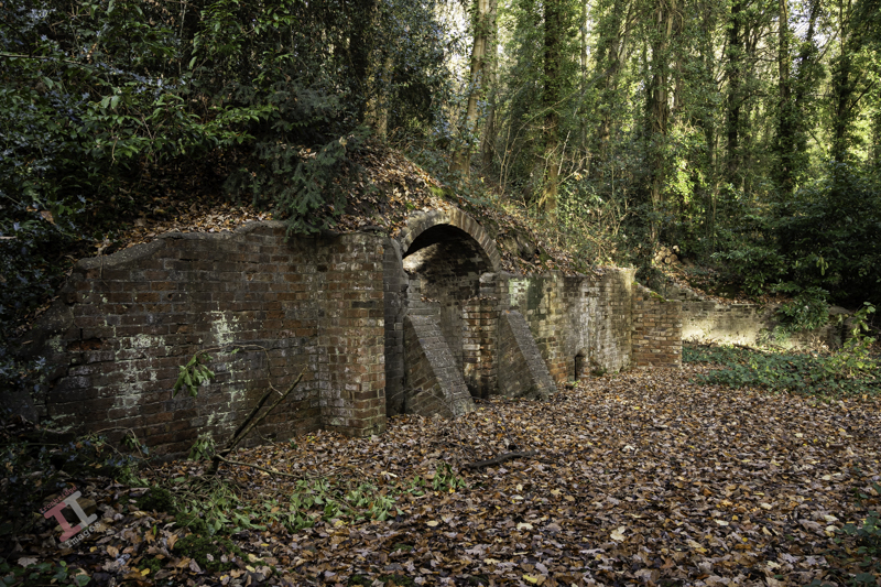
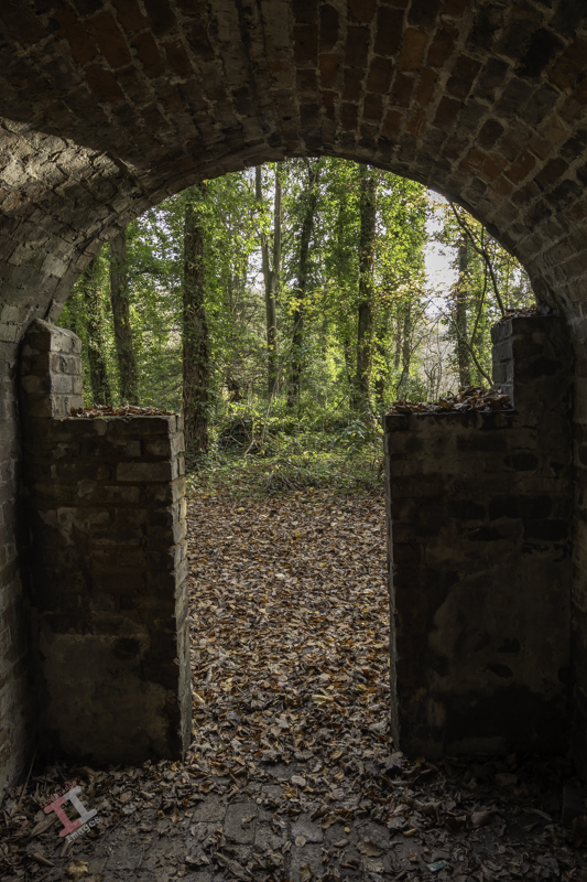
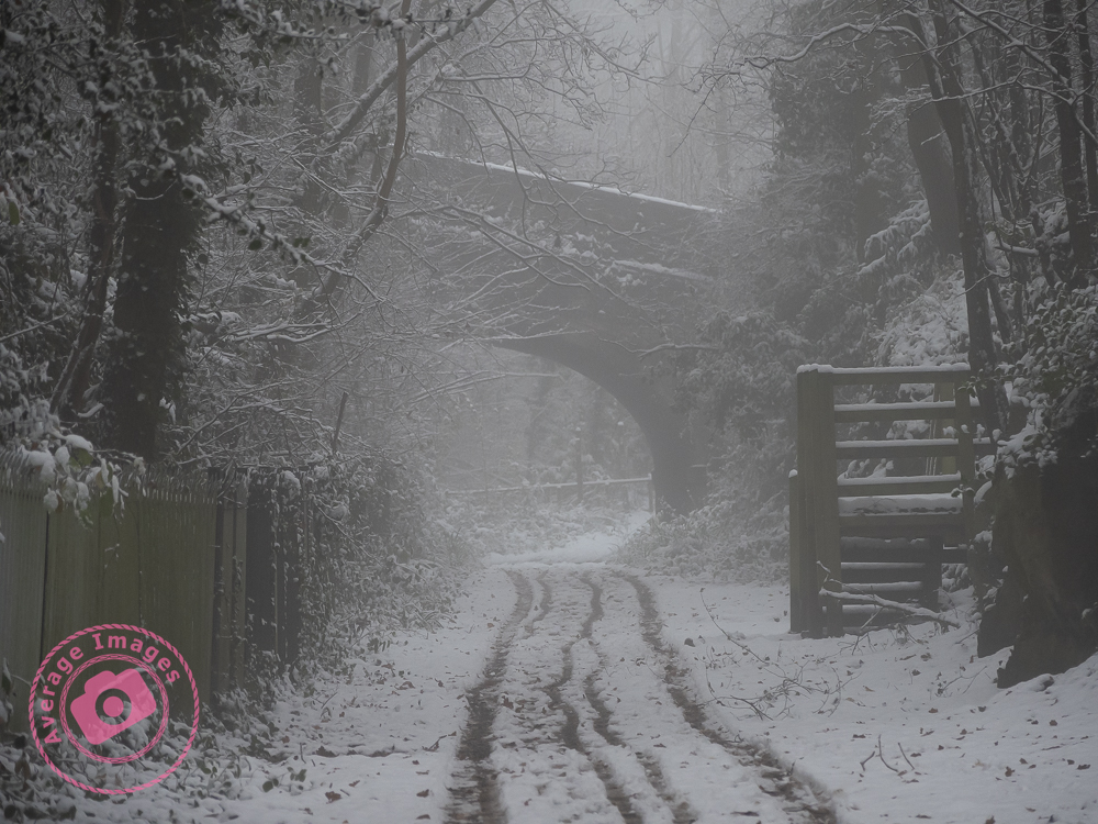
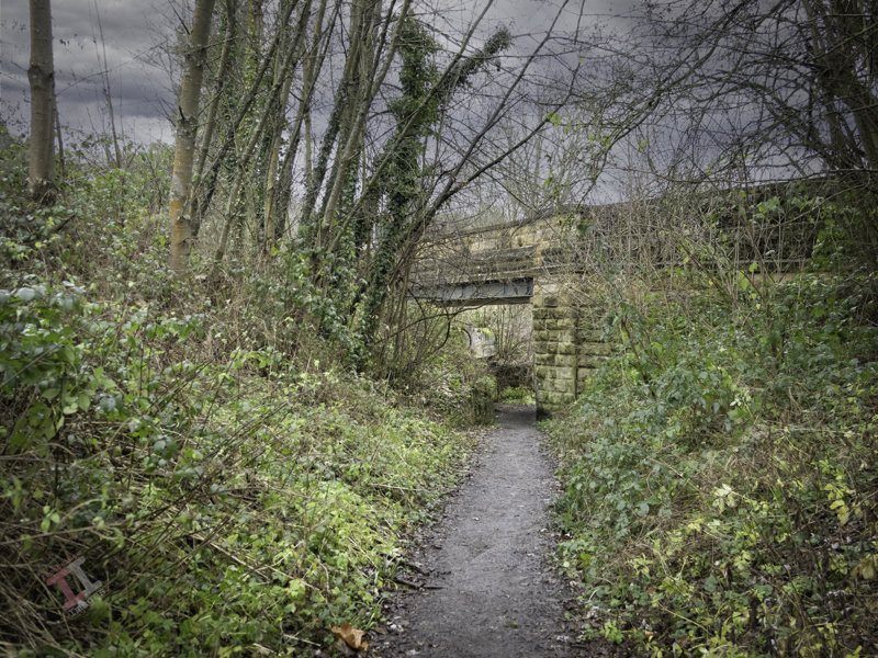
Just after these two bridges, the line of the railway drifts off the roadway to the left. Fortunately, you can still follow this because it is a footpath known as the Silkin Way, which leads you to a short tunnel which supports the main entrance to the old Blists Hill Ironworks.

At first glance, you may think this is just not high enough for a steam train to pass under – and you would be correct. In the 1960s, a huge double-pipeline was installed to take the storm water from the southern end of the newly developing New Town of Telford. Rather than dig a trench, they just laid the pipeline on top of the old railway track bed and covered it over. Hence, the pathway is much higher than the original railway track.

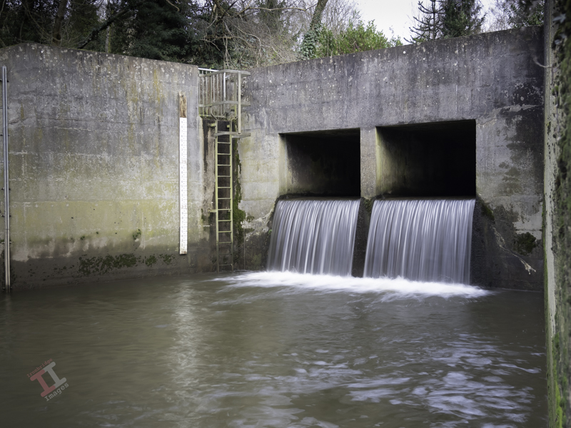
A little way after the tunnel, some metal fencing denotes the point at which the pipeline leaves the old railway line and continues downwards through the trees to the outflow into the River Severn. The pathway then reverts to the original level of the railway line.

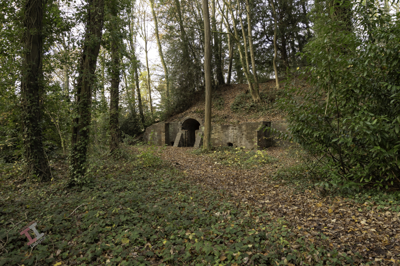
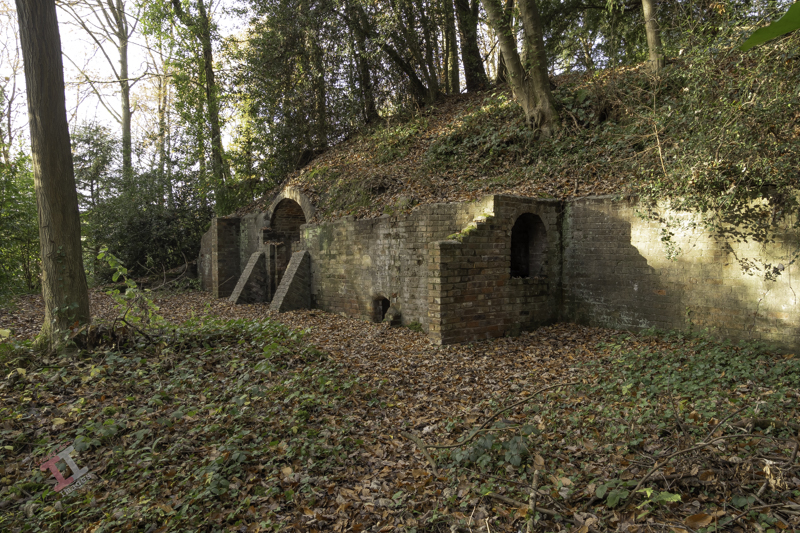
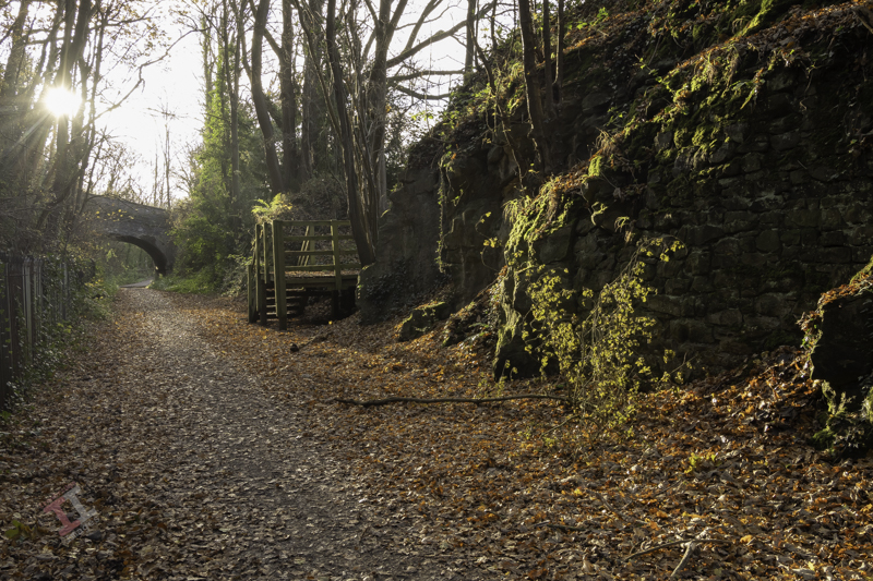
Further on, you pass under a much more interesting bridge. Built in around 1860, it supports the Hay Incline Plane – built some 70 years previously to transfer flat-bottomed iron tub boats down the steep valley side from the upper section of the Shropshire Canal in Madeley to the riverside section of the same canal in Coalport.

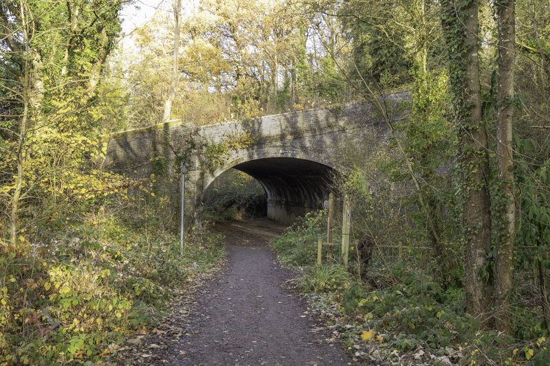
The bridge is unusual because bridges are usually flat on top to take paths, roads, and railways, but this one was designed to support an incline plane, so the top is distinctly angled. It is also a ‘skew’ bridge – in that the arch runs at an oblique angle to the spandrels that support it. At first, this may seem unimportant – until you think about the complexity of the brickwork and that it was built over 160 years ago before any computer-aided design. These types of skew bridges became increasingly necessary in the nineteenth century as the railway networks expanded and had to cross existing roads and canals without disrupting them too much.

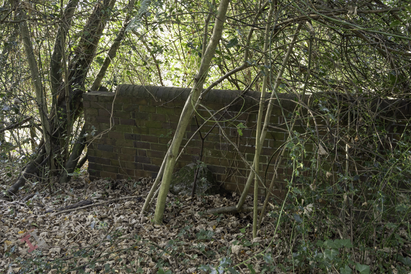
The railway line then starts to level out and run parallel to the river and eventually passes under yet another bridge, which, unusually for the Ironbridge Gorge, has stone parapets rather than brick ones. This road crossing is only single-file and crosses at a sharp angle – meaning it is ‘blind’ to drivers in either direction (reversing often ensues). Beneath, a retaining brick wall has failed due to constant subsidence, letting the soil spill down – and now a large sewerage pipe takes up some of the space. It’s hardly believable that once this bridge was wide enough to accommodate two railway tracks (although only one ever went beneath, the second terminating just before).

Not much further is another road bridge, which signifies the terminus of this LNWR line. It originally had cast iron riveted sides, but these were removed and replaced with brick in the late 1980s. The platform of Coalport Station (East) was situated underneath this bridge – although all signs of this have now long gone, and adjoining this was a railway yard, built in the 1860s, which was surprisingly lavish, with a large engine shed, a palatial double carriage shed, a goods shed, a water tower and, initially, an engine turntable. It survived for 100 years until the line was eventually closed in 1960.

It’s easy to get nostalgic and have a vision of a small steam train chugging through the trees overlooking the river in the sunshine – but the reality was that this was an industrial area, dominated by chimneys belching out black smoke from the furnaces that powered the Industrial Revolution, operated by workers who lived in quite squalid conditions. It certainly wasn’t somewhere to come on your holidays.

Railways declined throughout the UK in the 1960’s due to the rise of cheaper and more flexible road haulage. Even the small village of Coalport had its own haulage company. More of that in the next blog post of this series.

If you want to see more about Secret Ironbridge, subscribe to this blog (for free!) to keep up-to-date via your email inbox or the Reader app

Secret Ironbridge: Ice house

This is a new series of photographic blogs called Secret Ironbridge, featuring photographs and descriptions of areas of the Ironbridge Gorge in Shropshire that, although not exactly ‘secret’, are certainly overlooked by the tourism industry that now dominates the four towns and villages that lie in the valley:

  • Ironbridge
  • Coalbrookdale
  • Jackfield
  • Coalport

This blog series is a good excuse for me to get out, take photographs, and share some history of an area I have lived in all my life.

This first post features an ice house – the underground cellar from the long-demolished Madeley Wood Hall in the Lloyds Coppice, between Coalport and Ironbridge.

An ice house was used for storing ice throughout the year before the invention of the electric refrigerator (or indeed, electricity) and was typically located wholly or partly underground to utilise the natural insulation it provided. During the winter, ice and snow would be taken into the ice house, which would stay frozen for many months, allowing for the storage of perishable foods, cooling drinks and making cold desserts.

Of course, they tended to be associated with larger houses and halls, and this particular one was built for the Anstice family, owners of large areas of land and industry in the area. It was allegedly quite grand, brick-built, 3-storeys high, with a large entrance porch supported by four stone columns. Nearby was a couple of semi-detached houses (also now demolished) and a stable block serving the hall.

Here is a section of an old map from 1927 showing that the hall was quite substantial in size. The ice house is the upper-most outbuilding and was detached from the main hall (sensible, I guess, if it was full of ice). You can also see the semi-detached houses to the left and the landscaped area that used to be the tennis court.

To the upper right is another building that was, presumably, a gatehouse. On the right is the only remaining building – the stable block for the horses (now a beautiful private dwelling). The lack of trees and the grassed area to the front of the hall would have allowed magnificent views down the valley.

If you refer to the above map, you may see the heavily contoured area to the right of the hall. This was the London & North Western Railway (LNWR) line that ran from Coalport (East) station to Wellington. More of that in the next Secret Ironbridge series.

Waxing lyrical

As I was on the way back home this evening, I noticed that there was a beautiful sunset developing with a Waxing Crescent moon, and so I took a few shots with my OM-D E-M1 Mark iii. This is one of the many advantages of this small camera – I can quickly take it out of my shoulder bag and grab shots that I may have previously missed. I unashamedly admit to having it set on program mode as standard, on the basis that the small, but powerful, onboard computer chip will, 98% of the time, make a better, and quicker, judgement about exposure settings than I will – thus allowing me to concentrate on the composition. I know this will have many ‘serious’ photographers spluttering into their milk, but I also admit that I drive an automatic car and write this blog post with a computer and not a quill and ink.

Waxing Cresent Moon

As I uploaded these images I remembered a few I took earlier in the week of our Christmas decorations. These may be future stock images but it’s too late for this year and so I’ll upload them ready for Xmas 2024.

Painting with light: Let there be light. And there was light.

A little while ago, I decided to try my hand at a bit of Painting with Light, reawakening my interest in photography, which was sadly waning. Little did I know how much there was to think about – there is certainly more to it than meets the eye.

As I have been going along, I have been writing blog posts showing my progress and detailing my findings. It now totals 14 separate posts and there are many more planned. Therefore I have put together a section of this website dedicated to them, and listed in order so that anyone interested can follow along.

It is called, unsurprisingly, Painting with Light, and a link to it can be found in the top menu bar. Each post, of course, will still appear on the front page as well.

Blank canvas

The feature shot, ‘Blank Canvas‘ was inspired, in part, by my image taken in Story behind the shot: The Art Journal and partly by a prop that I’ve had in my studio for some years. Art, particularly painting, has been in my family for as long as I can remember. My grandfather used to sketch all the time (see Story behind the shot: Sketches of Yesteryear), my grandmother painted, and so did my father (who was formally trained). This skill seems to have passed me by – although maybe my photography is the link in my genes.

Anyway, back to that prop, it is a pot used to store artists’ brushes. I have a collection of brushes stored in it, and so my idea was to have the pot and brushes next to an artist’s easel containing a blank canvas. I also have a small artist’s palette which, although well-used, would fill the foreground.

In reality, the easel was just too tall and would have left too much empty space at the top of the image. However, I did find a palette knife which I added to the scene to act as a leading line.

Hopefully, it is clear what is the hero of the shot and what is the supporting cast, although you may wonder why I have pointed the leading line of the palette knife to the canvas and not the pot. This is because I have used a compositional tool called The Fibonacci Spiral.

The Fibonacci Spiral is based on a mathematical formula known as the Golden Ratio. I won’t bore you with the details (you can easily find the explanation by searching on the internet) but this spiral occurs naturally in anything from the Milky Way, to snail shells, to the water running down the plughole in your bath. The interesting thing for photographers (or artists), is that it is a naturally pleasing way for the human eye to operate. Subconsciously, when you look at something, you don’t just look straight at it, you survey the scene first before focussing on the main point of interest – and studies of the eye have shown that this surveying of the scene follows the path of the Fibonacci Spiral.

If you use Lightroom in your post-processing workflow, you will find that the Fibonacci Spiral is one of the crop overlays. When you choose the crop tool in the Develop module, press the letter O and it will cycle through 9 different compositional guides, one of which is the aforementioned spiral. The position and orientation of the spiral may not be correct for your particular image and so if you press Shift + O it will cycle through all of the available options (8 in total).

Footnote: This was literally the last set of shots that I took with my Pentax medium format set-up before I sold it off and moved to my present Micro Four Thirds camera/lens combo. Fortunately, painting with light doesn’t necessitate the need for large sensor sizes and huge image resolutions, as I hope to show in later posts in this series.

If you want to follow this series about Painting with light, or you want to see more photographic titbits, then why don’t you subscribe (for free!) to get an email reminder:

Painting with light: Sweetness and light

As you may have gathered from my post Warning Light I have recently purchased a Wacom Intuos Pro graphics tablet to aid with my Painting with light composite post-processing. I chose to buy the ‘small’ version which has a working area of 6.3 x 3.9 inches (160mm x 100mm). To me, this is a more than adequate size to be able to work without moving my hand around too much, and is pretty much the same area that a mouse covers on a mouse mat. Even so, the actual tablet itself is still about the size of a piece of A4 paper, and I have seen numerous reports from people who have bought the (larger) medium size and then wished they had gone for the small instead for precisely these reasons. Bigger isn’t always better!

Note: There is a difference between a graphics tablet and a drawing tablet. Graphics tablets have no screen, and you need to work with a computer monitor to see what you are doing. Drawing tablets have their own screen, and so you can work directly on them.

Wacom Intuos Pro (S)

The tablet itself plugs into the computer via a supplied USB cable (it can work via Bluetooth but then you have to purchase an optional battery) but the pen requires no batteries or charging. There is a nicely weighted stand for the pen (it advises against standing the pen up in storage to prevent wear & damage of the nib) which also acts as a storage compartment for a range of spare nibs and a nib removal tool. There are black nibs, white nibs and a spring-loaded nib – I have no idea what the difference is between them but will try them out in due course. There is also a handy storage bag to keep the surface of the tablet dust-free when not in use.

Wacom Tablet software

The driver and software are simply downloaded from the Wacom website and allow a multitude of customisations to the way that the tablet & pen work and feel. So far I have pretty much left it at its factory settings but maybe after prolonged use I may feel the need to add some customisation. Interestingly, you can have different customised settings for different programs; so you can have one set for Photoshop and another for Lightroom, for example.

I still find that I instinctively use my mouse and so I’ll really have to make the effort to use the tablet until it becomes second nature.

Snow surprise

Even though the weather forecast had warned of snow flurries, it was a surprise this morning to wake up to find a couple of inches of the white stuff had fallen overnight.

Painting with light: Light entertainment

When taking Painting with light shots, it is best to think of it as a two-step process (even though there will inevitably be more than two shots). Step one is to take the initial image, which will be the ‘hero’ of the finished work. Step two is to take a series of shots with individual elements lit up within the scene. These will be the ‘supporting cast‘ to the hero, ultimately blending together to produce the final output.

In this shot, “Hands of time” the hero is clearly the clock movement, even though it is in the rear of the shot. The viewer’s eye needs to land on it, and the supporting cast (in this case, the clock face and the hands) are there to help. Using positioning, lighting and compositional techniques, you can ensure that the supporting cast doesn’t take the attention away from the hero while still adding support.

The first shots were taken with the clock movement in focus, each with the light shining from a different angle. These shots were later merged in Photoshop using blending modes and layer masks.

I then refocused on the clock hands and took several shots, adjusting the focus as I got closer to the clock face. I wasn’t concerned with the light spilling from my wand because all of that section of the image would be blocked out with a layer mask. It is essential to have the camera fixed firmly on a tripod so that it doesn’t move as you adjust the focus.

Once I had got to the foreground, I refocused again on the clock face and took several shots, which, again, were merged together with blending modes and layer masks.

The final shot was back at the clock movement again to create the shadow on the background. I actually forgot to refocus on the movement, but it didn’t matter because I removed that part of the image with a layer mask and just kept the shadow.

So in total, I took 23 shots but only used 13 of them in the final image. For me, the most entertaining part of Painting with light is that you never really know how each image will contribute to the overall composition until you add its layer in Photoshop. Some of them surprise me with the effect that they give, while others are underwhelming and can be ignored.

Note: All of the small images above are cropped for the purpose of the description. Each image, as taken, was full size.

It’s not a bird

Mention IBIS, and some of you may think of the French budget hotel chain of the same name; others may think of the heron-like wading bird. Photographers, however, think of In Body Image Stabilisation, which works by physically moving the sensor within the camera to counteract any movement created by the photographer. This then enables longer shutter speeds when hand-holding the camera.

Although it is often described as a new innovation, every Pentax DSLR that I have ever owned had IBIS (they call it Shake Reduction) – which works using built-in gyroscopes to provide stabilisation across the 5 axis: Yaw (left & right twist), Roll (back and forth rotation), Pitch (side to side rotation), Horizontal (side to side) and Vertical (up and down).

The Olympus OM-D E-M1 Mark iii also has IBIS, which provides up to 7.5 EV of shutter speed compensation when combined with an image-stabilised lens, such as the Olympus M.Zuiko ED 12-100mm f/4 IS PRO. I put this to the test last night when I attended the annual Christmas lights switch-on at nearby Ironbridge town in Shropshire.

To be honest, I wouldn’t usually take any photographs at such events, mainly due to the need to use either a tripod or a flash gun, but this was an opportunity to try the camera hand-held in some pretty testing light conditions, and it didn’t let me down.

Footnote: The Olympus OM-D E-M1 Mark iii also puts the IBIS technology to another use: ‘High Res Shots‘, but I’ll cover that in a later blog post. You can find out when if you subscribe:

Painting with light: Warning light

For my Painting with light composites, I use Adobe Photoshop to blend two or more images together, but I often find that using a mouse is not very accurate – which can be annoying, especially when making detailed adjustments. I was therefore toying with the idea of buying a graphics tablet – but a decent Wacom Intuos Pro is £200 just for the small one, which is a lot to spend if I subsequently found I didn’t get on with it (I should mention at this point that many years ago I had a graphics tablet but never really used it – although I wasn’t using Photoshop in the same manner back then, and it was only a cheap one).

As I was reviewing alternative models, it reminded me that I could use my iPad, not only as a second display but also as a second input – thus also utilising my underused Apple Pencil. Now I had already tried this before and was less than impressed. However, I had heard that the process has improved with later software upgrades, so I decided it was worth another try.

These are the minimum requirements in case you are considering trying the same thing: You will need to be running MacOS Catalina or above on your main computer and iPadOS 13 or above on your iPad.

As soon as I tried it, I remembered why I didn’t like it the first time. If I set the iPad as a duplicate monitor, the aspect size on the primary monitor changed to suit the aspect size of the tablet. The program screens also moved into new positions, which meant relocating them before starting. The editing itself worked OK once everything was in the correct position (see below) but it was somewhat disconcerting to have the program screens a different size and position from normal. If I set the iPad as a secondary monitor, I then had to drag Photoshop onto the tablet and do the editing on that. Although the Apple Pencil gave much better precision than a mouse, I was now working on a much smaller screen – which was all somewhat counterintuitive.

Duplicating the monitor on an iPad

The other problems were that the Apple Pencil isn’t detected until it actually touches the screen, which means you are working ‘blind’ when trying to locate the pencil on the image to start editing (this is worst when using the duplicate monitor setting, and you are using the pencil on the iPad but looking at the image on the primary monitor) – and that the area being edited by the pencil didn’t seem to match the position of the cursor exactly which created some error when making fine adjustments.

Unfortunately, despite trying hard to make it work (I really wanted to find a good use for the Apple Pencil), I ultimately decided there were too many compromises. I therefore took the plunge and ordered a Wacom Intuos Pro. Look out for the follow-up blog post to find out how I got on.

Painting with light: Light hearted

As stated in my last Painting with light blog post, there usually needs to be a hero to act as the heart, or focal point, of an image, whether it be a painting or a photograph.

A photograph showing the hero of the shot utilising compositional techniques to lead the viewers eye.
Climbing the academic ladder

In this shot ‘Climbing the academic ladder‘ the hero is clearly the mannequin, and so it was important to make sure that is was sharply in focus and lit well, to bring out the detail. This is a fairly simple shot; others may have far more content competing for attention, and so it is important to recognise what is the focal point of the shot, and make sure that it draws the eye, which may be achieved with quite subtle use of lighting, leading lines and other compositional techniques.

Here, the mannequin is aligned with a ‘third’ line and the main body is on the intersection of the vertical and horizontal ‘thirds’. Also, the mannequin is looking ‘in’ to the shot, rather than out of it. These are all long-standing compositional rules used by classic Greek architects, up to the present day.

When taking still life shots you really need to have an idea or a concept of what you want to achieve before you start. If you just walk into an empty studio with no preconceived thoughts of what you are going to photograph you are likely to leave with nothing.

This was another shot where I had sketched the idea first before I even set foot in the studio. It doesn’t matter if you deviate away from the original plan; it is just there as a foundation for the concept to be built upon. I use OneNote on my iPad for my conceptual sketches but you could just as easily use a good ‘old-fashioned’ paper notebook instead.

A conceptual sketch is important to avoid leaving the studio empty handed.
Conceptual sketch

Painting with light: Come on baby light my fire

Don’t push your luck

A Painting with light is composed of two separate compositional elements; the physical composition and the lighting composition.

The physical composition is the scene in front of you and, like any photography, there needs to be a subject and the same artistic ‘rules’ apply: leading lines, rule of thirds, etc.

I suggest that the best way to achieve a good physical composition in Painting with light is to take a test shot in the light so that you can see the elements within the frame and decide which needs to be lit later on. You can also miss some distractions in the darkness, which may spoil the composition but are only noticeable when you view the image on a large monitor.

The lighting composition is what you are going to add to the physical composition. In most other genres of photography, you are ‘seizing the moment’, but in Painting with light you are ‘creating the moment’. You need, therefore, to be able to visualise how the scene will look and how to use the physical elements in the scene to optimise that visualisation. This is not particularly one of my strong points, which is why I prefer to take multiple shots and then combine them together in post-processing. In this way, I can change the emphasis of individual elements as I build up the overall lighting composition. We will look at post-processing in later blog posts.

The hero and the supporting cast

This mantra is often used by still life and product photographers and uses the analogy of a theatre play or a movie that usually has a hero (or heroine) who is surrounded by others who give context to the situation (the supporting cast). Although the hero may be the centre of attention, they would be meaningless without the supporting cast. Neither is more important than the other.

And this is never more true than with Painting with light. There needs to be a subject (the hero) and then other elements within the shot, and the way that you light them, become the supporting cast.

An advantage of producing the final image as a composite of multiple shots is that you can vary the contribution of each of the ‘supporting cast’ so that a balanced image is created. The ‘hero’ will still be the main subject, but in a subtle manner, whilst each of the ‘supporting cast’ will have their own place as secondary interest in their own right.

Whether your composition works to create a great image is always a gamble; sometimes it will work, and sometimes it won’t, but don’t leave it to chance and put as much thought into it as possible.

This leads me nicely to my featured shot: “Don’t push your luck“. I find it useful to pre-plan compositions whenever I can and use Microsoft OneNote as a sketch pad, using my iPad and Apple Pencil. The ‘gun’ is actually a starting pistol (and totally harmless), and I purchased the dice and cards specifically for the shot. You can see that my original plan was to create a monochrome shot but, during post-processing, I decided that it worked better in colour.

The title of this post comes from the lyrics of the song ‘Light My Fire’, written and performed by the American rock band The Doors in the 1960s. There have been numerous cover versions since then, with Will Young’s release in 2002 being one of the most successful.

Remember, you can keep up-to-date with all of the Painting with light blog posts by subscribing:

Painting with light: Blinded by the light

Poisoned Chalice

As you do more Painting with light, you will probably start to discover some of the shortcomings of working with your torches – particularly doing still-life indoor shots when the beam of light may be too broad and too strong.

This is where light modifiers come in very handy. As the name implies, they modify the light from your torch to make it more suitable for the task at hand. Of course, you could buy a range of torches with different types of light beams, but that would be rather expensive, alternatively you can make the modifiers below very cheaply and easily.

Light fitting sleeve:

I do suggest that before you start making any light modifiers you think about how you are going to attach them to your torch. You may think that just holding them on, or taping them on each time, will be sufficient. But remember that you are going to be using them in the dark and, if outside, probably in the cold as well. Therefore try and choose a torch that will accept a tubular sleeve so that you can just slide it on and off.

In my case, I found a length of plastic conduit pipe in my shed, which had an inside diameter that exactly matched the diameter of my Scangrip Matchpen pen torch. It was long enough to be able to cut multiple lengths so that each of my modifiers can be permanently attached to one. If you aren’t fortunate enough to find a piece of tube of the correct diameter then use some cardboard core from inside a kitchen roll, cut it through lengthways and then roll it to the diameter that you need and tape it up.

Snoot:

A snoot is a funnel shape and narrows the light beam down to allow you to finely light individual areas for detail. These are easily made with card (or thick paper) rolled into a conical shape. The cone can then be simply cut with scissors to match the light fitting sleeve at one end and the size of the desired light opening at the other.

Shield:

If you are trying to back-light an object with the torch facing the camera you will get light trails showing in the image. To prevent this, make a shield which will hide the end of the torch. This is simply a flat, rectangular, piece of stiff card, attached to a light fitting sleeve. The size of the rectangle is largely down to personal preference.

Wand:

When doing still-life images and working quite closely to the subjects with your torch, it is easy to get ‘hot-spots’ of light, and very harsh shadows, which are difficult to blend in during post-processing. To prevent this, use a light wand – a long strip of diffused light, which you can ‘wave’ over the subjects. You can buy them, of course, but you can also make one very easily with just a few tools.

Take a length of white plastic tubing (look in the plumbing or electrical section of your local DIY store) and cut a suitable length that will attach to your torch but leave about 30cm for the actual light wand.

You then need to cut a slot down the length of the tube, whilst leaving the ends intact to maintain its shape. I used a multi-tool but you could use a sharp knife, if you are careful.

Don’t forget to seal the end of the tube to stop the light coming out

Cover the slot with a diffusing material (thin tracing paper or baking paper works well). Then wrap the rest of the tube with non-reflecting black tape. I used electrical insulating tape.

When using a light wand you will have to spend a lot more time than with your torch alone to get the same exposure, due to the light being diffused.

Prevent reflections:

In all cases, cover all of the outer surfaces of the modifier with black tape to prevent reflections on the surface being picked up during a long exposure.

The shot Poisoned Chalice (above) was lit using my set of modifiers to control the light. Curved glass is notoriously difficult to light successfully because it readily picks up reflections from any nearby light source and I found that painting with light (with modifiers) was considerably easier than using strobes in this situation.

“Blinded by the light’ was a song written and performed by Bruce Springsteen in the early 1970’s although it was subsequently sung (albeit modified) by Manfred Mann’s Earth Band, which is the version that most people recognise.

Generation gap

In my previous blog post Panic at the packaging factory? I mentioned that I had used Photoshop to fill in the gaps in the upper corners of an image background. Due to the short time I had to finish the job, I used the eyedropper tool to sample the background colour and then painted in the corners using a brush. This worked fine because the background was almost white, and there was no significant colour gradient next to the area I needed to fill.

I was subsequently asked to create some similar shots and, with more time to do the post-processing, decided to try the Generative Fill option in Photoshop instead. This is a relatively new and powerful update, but what I wanted it to do was just the tip of the iceberg of what it can potentially add (or take away).

Generative Fill is available from Adobe Photoshop version 25.0 onwards.

As shot

With the image open in Photoshop, I needed to select the area with the missing background, so I chose the lasso tool and traced around as close as possible. As I completed the selection, the floating Contextual taskbar automatically changed to the Generative Fill taskbar.

Note: If you can’t see the Contextual taskbar then click on Window in the Menu bar and look towards the bottom of the long dropdown list and make sure that Contextual Task Bar is ticked.

I pressed the Generative Fill button and then the Generate button. By leaving the “What would you like to generate” box empty, Photoshop automatically filled the area with content based on its immediate surroundings.

It takes a little time but this is indicated by a progress bar.

It will then apply the generated content onto the image, but also give you another two variations in the Generative Layer panel to the right. You can press Generate again if you are not happy with the initial three offerings.

The generated image is applied as a layer so you can always go back and change it later if you want.

Generative Fill uses Artificial Intelligence (AI) to decide what to add to the image. In the case above it was used as a shortcut to fill in an area of missing background, but, of course, it could have been used to add something else entirely, maybe something that may be seen as being slightly dishonest. This is the conundrum facing photographers: what is acceptable and what is not? Of course, this is not a new phenomenon; the Cottingley Fairies photographs from 1917 are early examples of ‘generative fill’, albeit without sophisticated software.

Painting with light: Black and light

Painting with light works very well in monochrome because the lack of colour in the image accentuates the tonal ranges between the light and dark areas. As with any monochrome image, the best ones work when you have pre-planned it, rather than those that you have desaturated just because they didn’t look good as a colour photograph.

Black & Light

You can buy cameras that only take monochrome photographs (examples include the Pentax K3-III Monochrome) or you may find a ‘black & white’ setting on your existing camera. Personally, I just take the images as normal but concentrate on the effect of the light and shadows, rather than the colour, and then desaturate the image in post-processing (usually using the ‘black & white’ module in Lightroom).

The subjects of this shot are actually life-sized wooden ornaments taken on a hastily rearranged dining room table, thus showing how easily you can create a studio-type setting using the Painting with light technique.

Remember, you can keep up-to-date with all of the Painting with light blog posts by subscribing:

A walk in the park

The National Trust had an Autumn deal which gave free entry to their properties and so we chose to visit Attingham Park in Shropshire. This is very local to where we live but neither of us can recall ever visiting before and it was an opportunity to give the dogs a good walk in a change of scenery. Given the bleak forecast of rain all day we were all wrapped up accordingly, but fortunately it stayed relatively dry throughout the time that we were there. The grey, drab, overcast sky meant that photographic opportunities were few and far between, but I managed to take a few to justify carrying my gear around.