
Ironbridge Images has now updated its logo for something a little more modern and more easily recognisable.
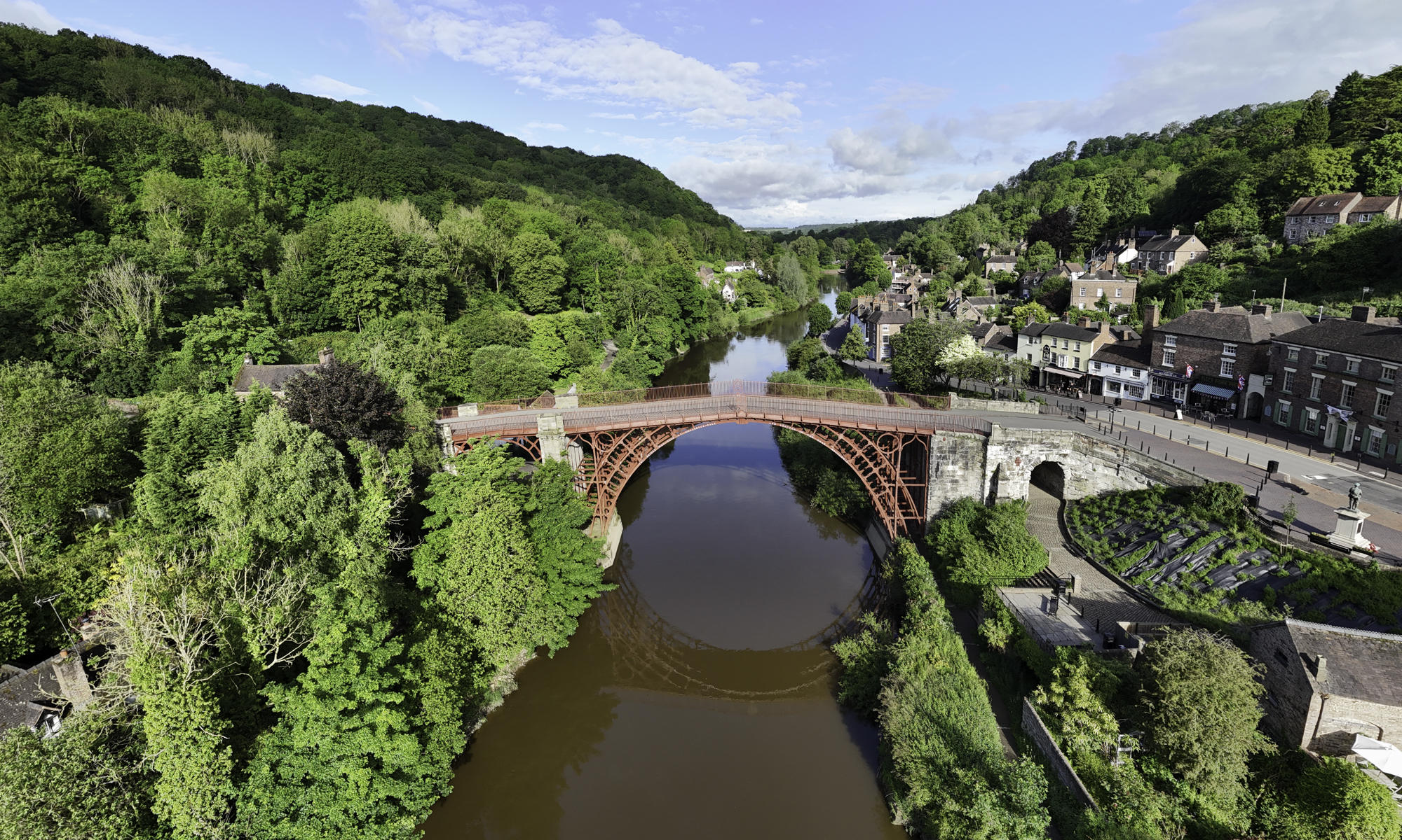
As Ironbridge Images moves forward with this new logo, it aims to continue its mission of preserving and promoting the history of the Iron Bridge and its surroundings. The logo is a step towards a future where the past is honored and the present is celebrated, ensuring that the legacy of the Iron Bridge lives on for generations to come.
The new Ironbridge Images logo is a perfect blend of tradition and modernity. It stands as a testament to the enduring legacy of the Iron Bridge and the vibrant community it represents. Whether you’re a local resident or a visitor, this logo is a reminder of the remarkable history and bright future of Ironbridge.
Hopefully you can see that it is made up of two capital letter I’s, the colours of each signifying the new, and old, colour of the bridge. I had two choices; one ‘square-on’ and this one at a jaunty angle. The marketing department (a.k.a. Mrs. H) decided that the angled one was best!

Discover more from Ironbridge Images
Subscribe to get the latest posts sent to your email.
